
Caffè Opera – Progetto Logo e Packaging
Goal
Create a complete visual identity for Caffè Opera, a young coffee distribution company based in Caserta, enhancing quality, attention to detail, and Italian provenance through logo, packaging, and coordinated materials.
Concept
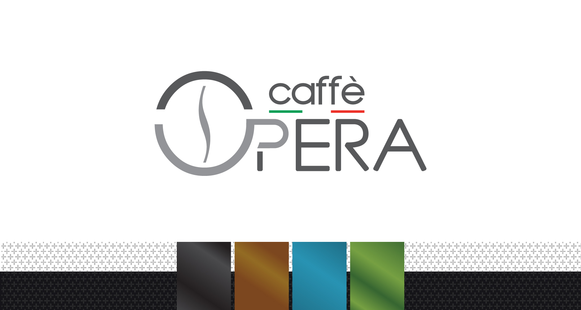
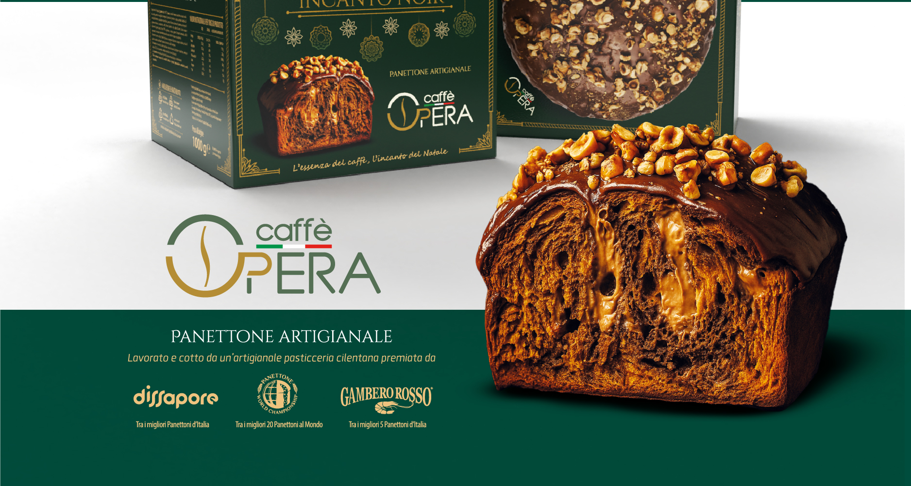
The logo had to convey modernity and sobriety, integrating graphic elements that recalled the product itself. The idea was to combine the letters “O” and “p” to create a stylized cup, from which an S-shaped mark develops that represents the aroma of coffee, allowing a grain to be glimpsed inside the letter “O”. The Italian tricolour underlines the national origin of the product.
Development
I followed the entire 360° graphics project, dealing with:
Logo and coordinated image;
Company materials (business cards, letterhead, etc.);
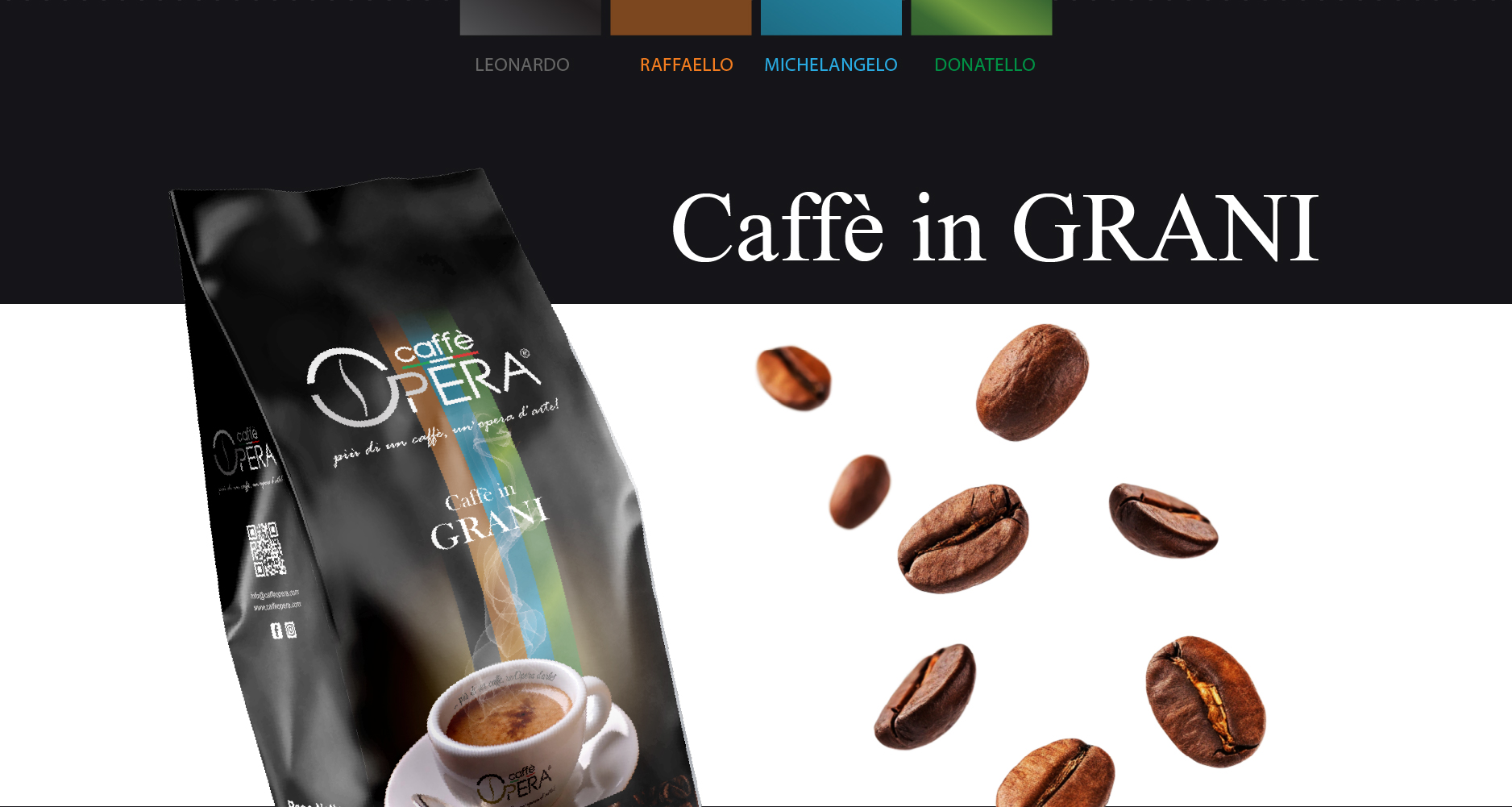
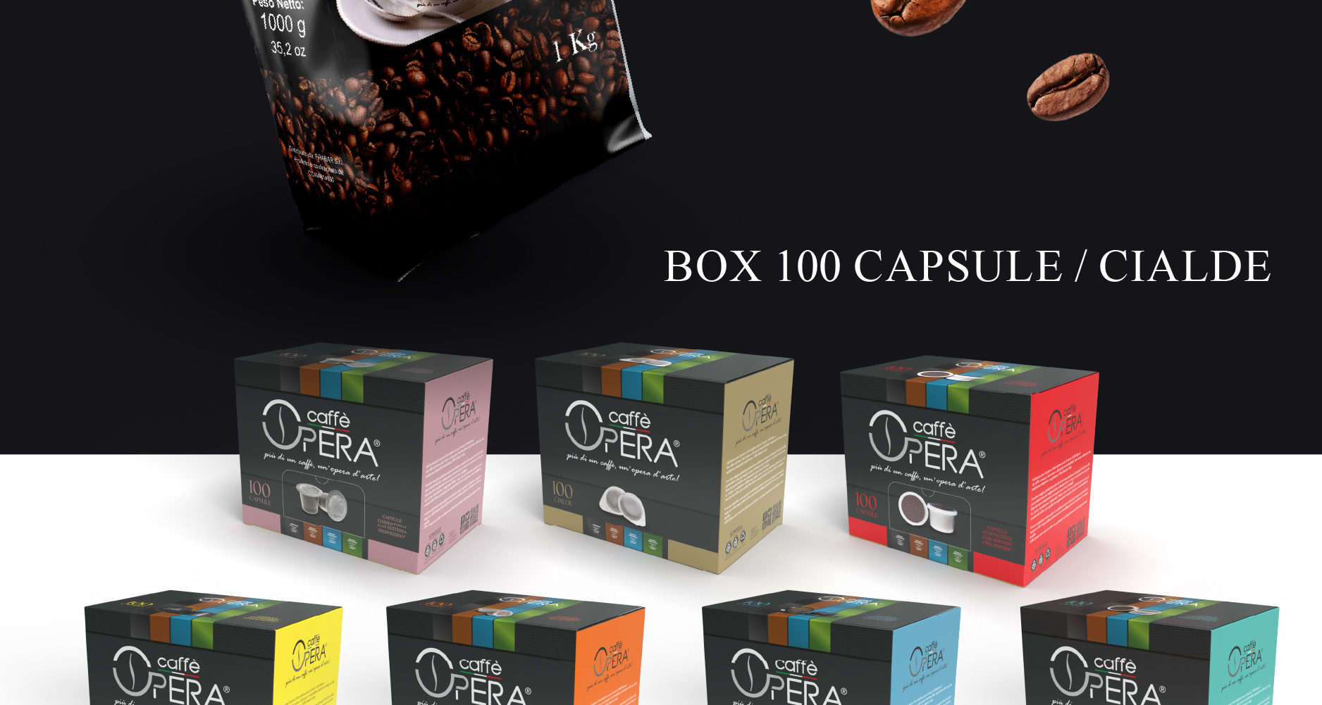
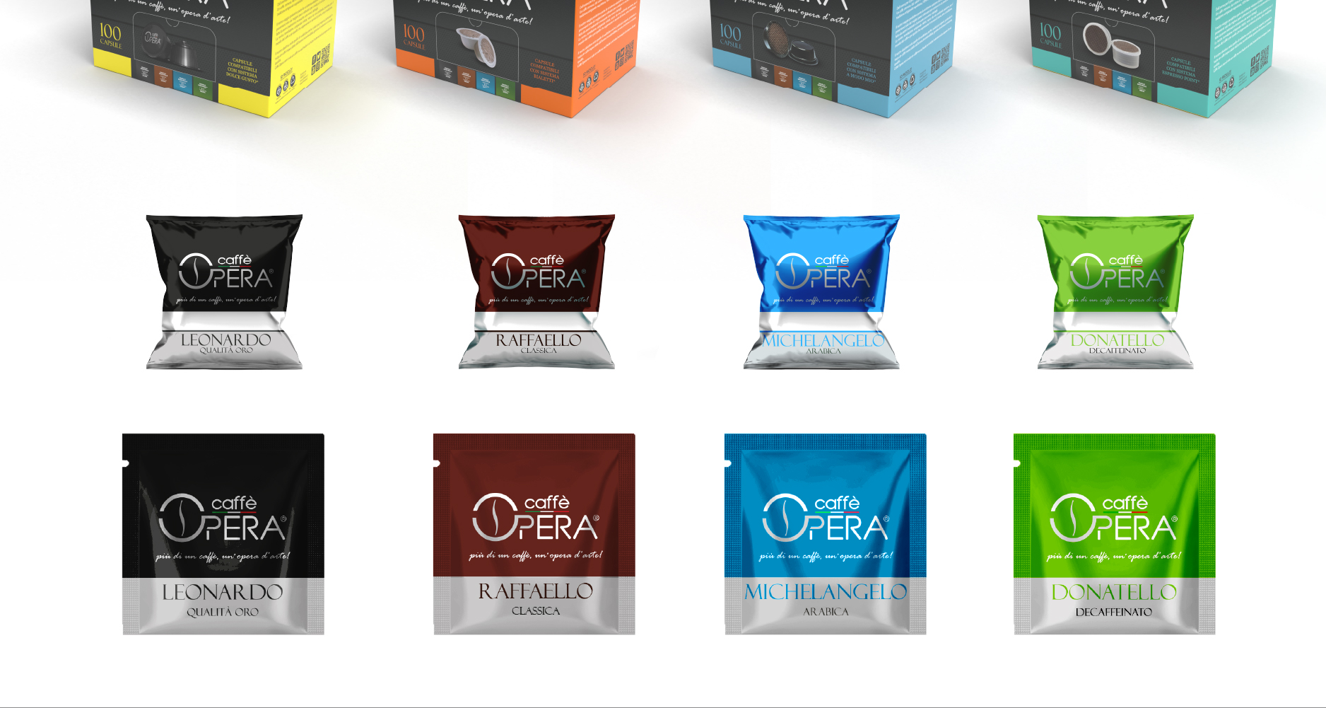
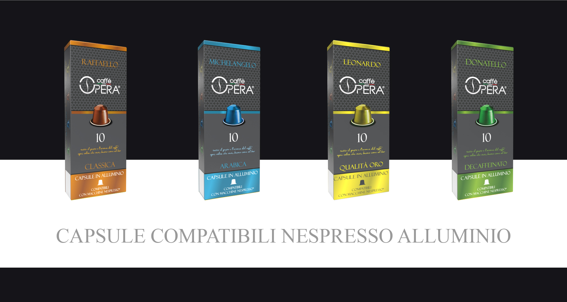
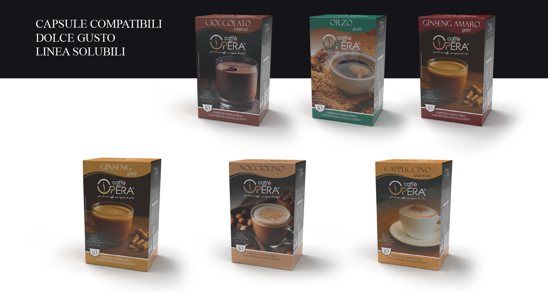
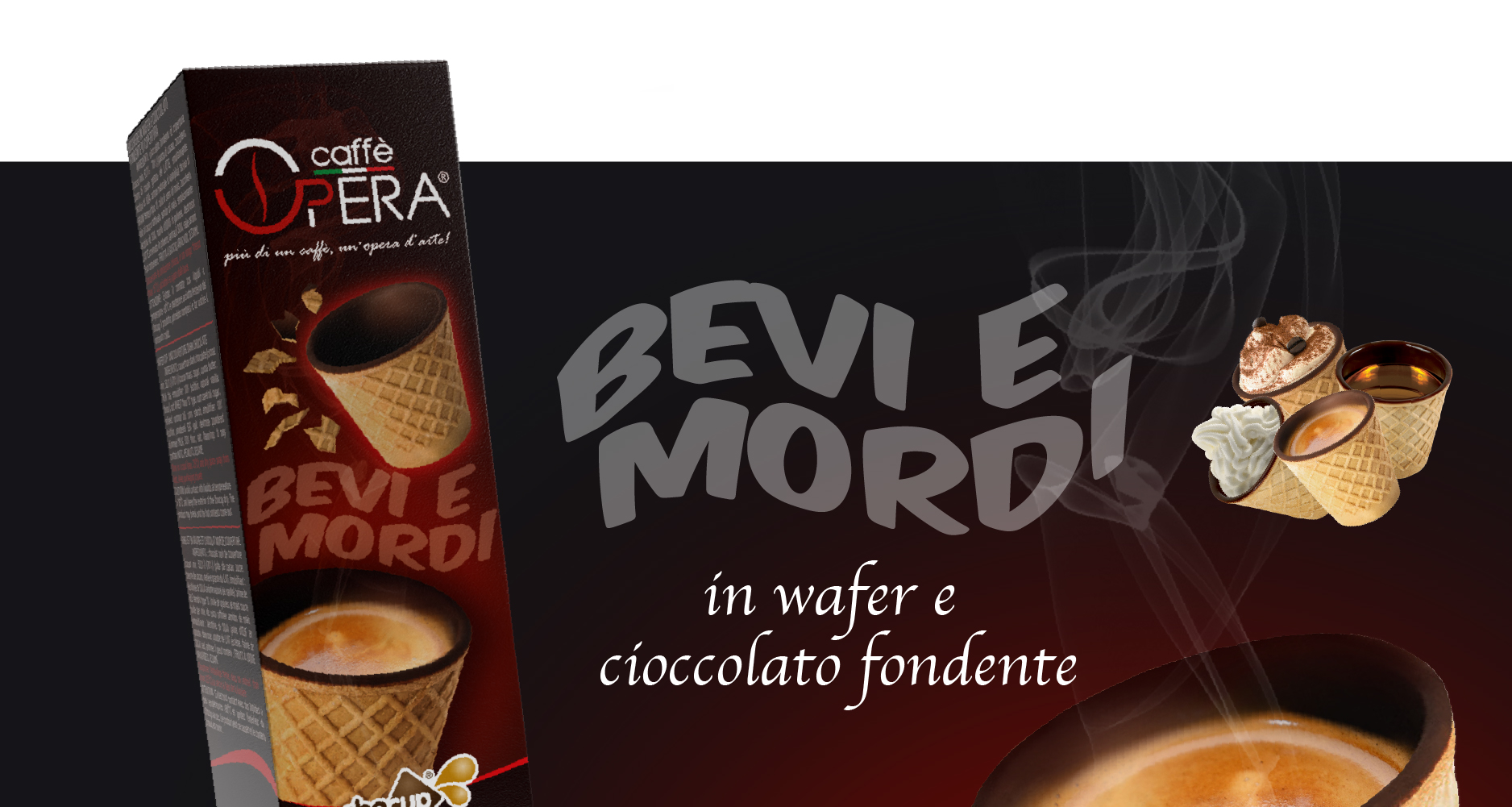
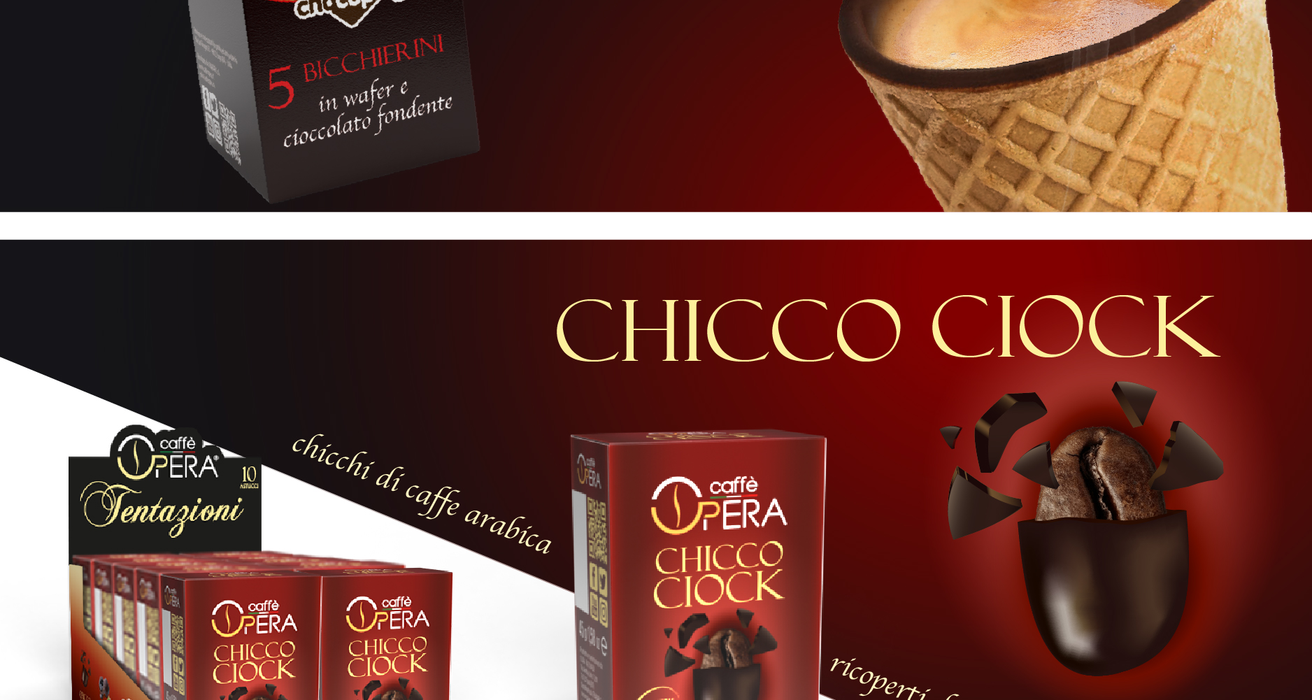
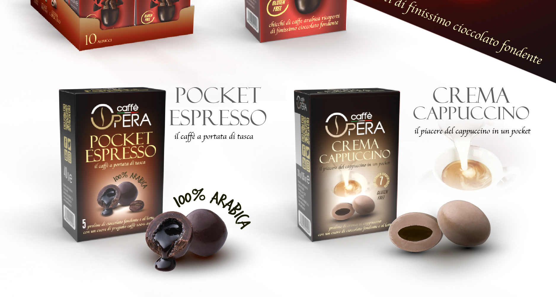
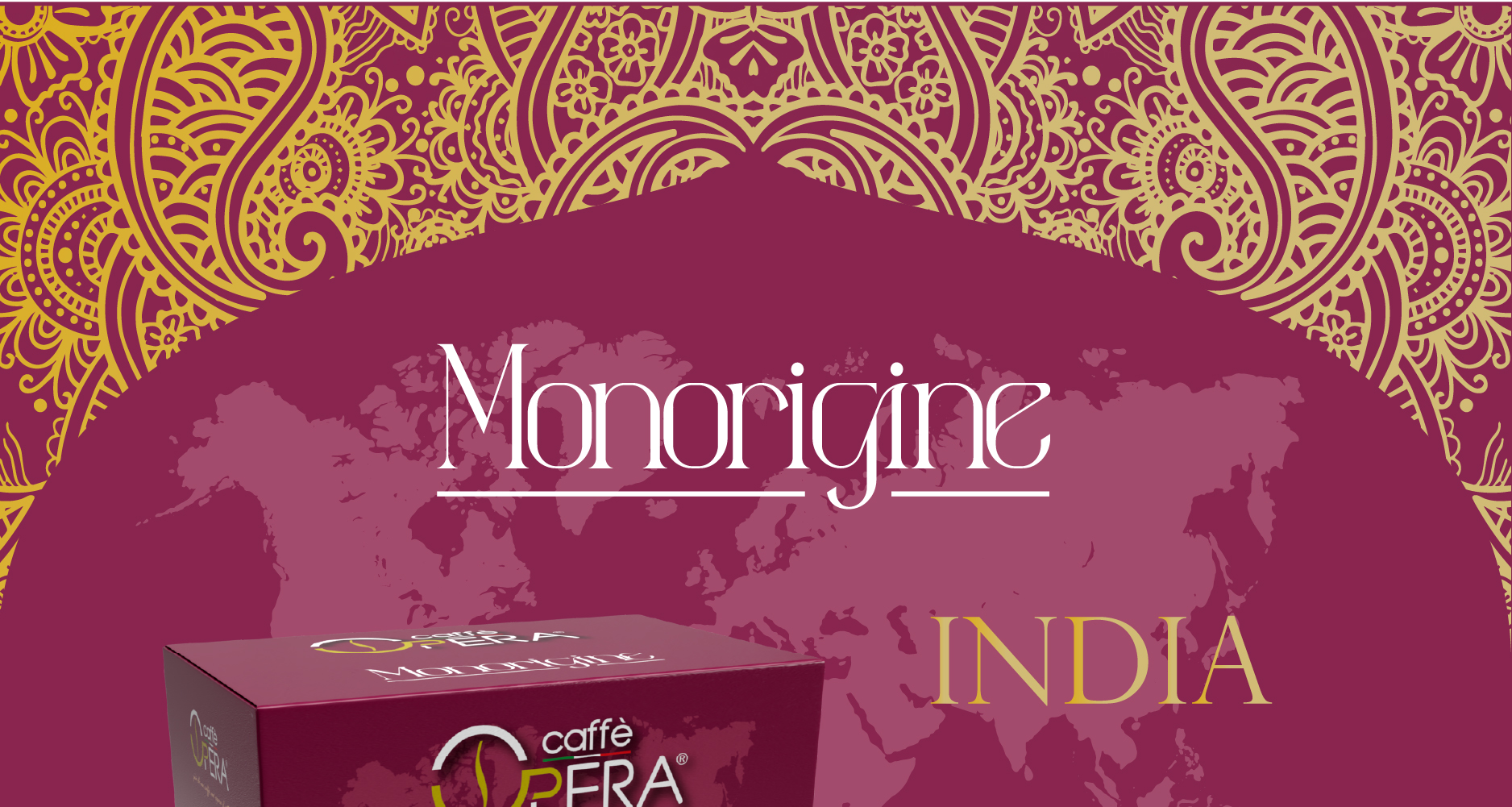
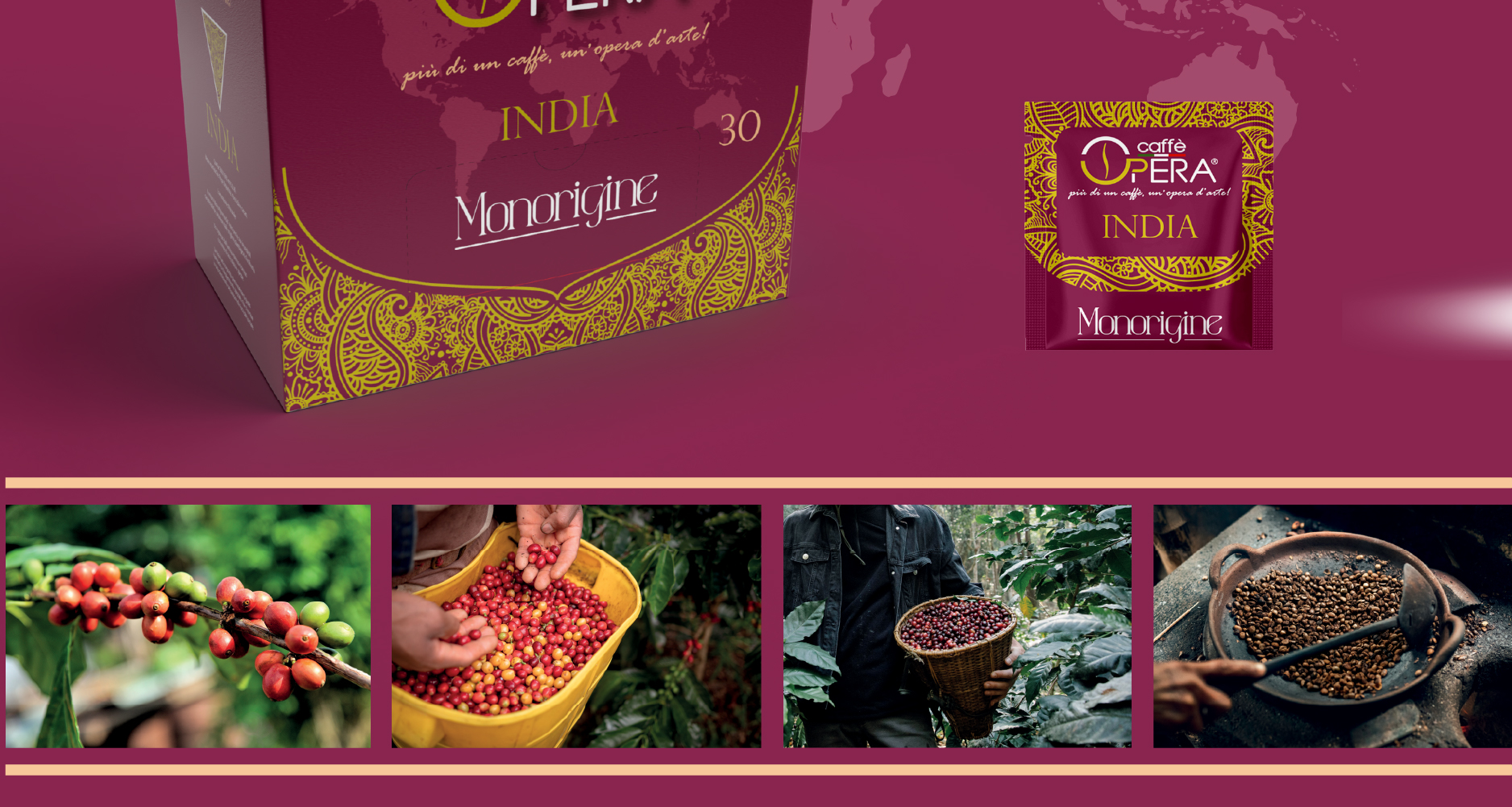
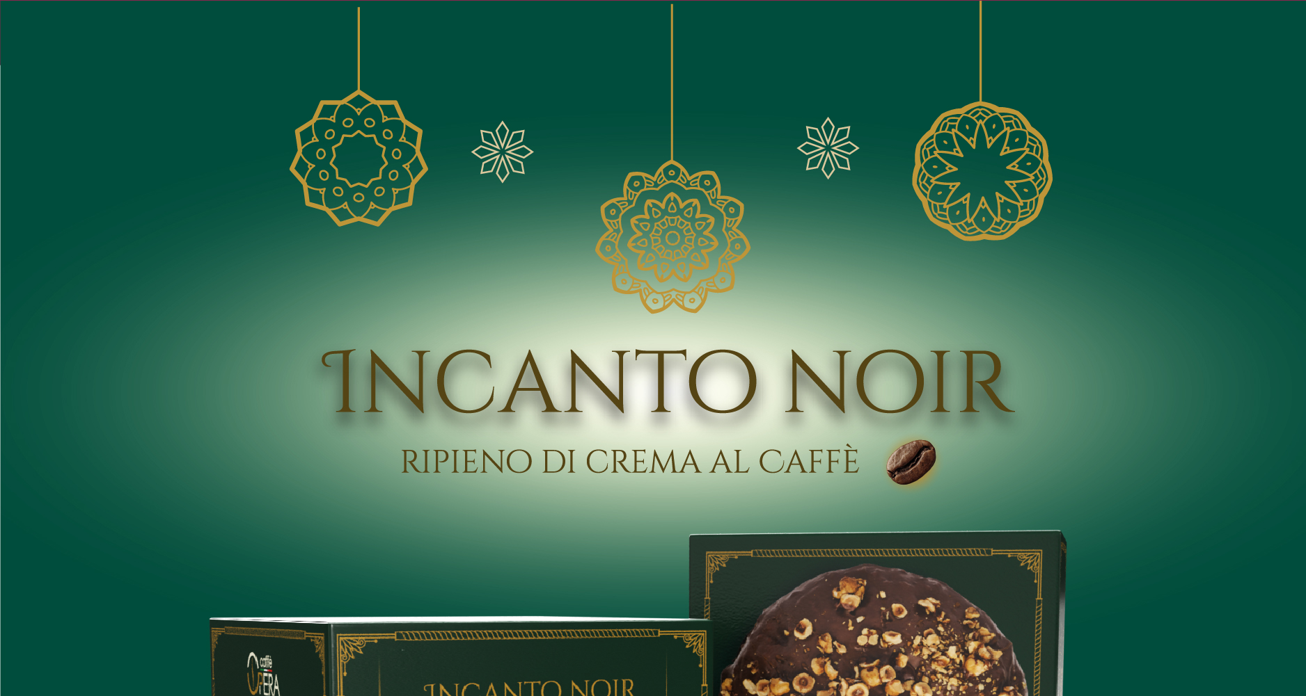
Graphic packaging of all products;
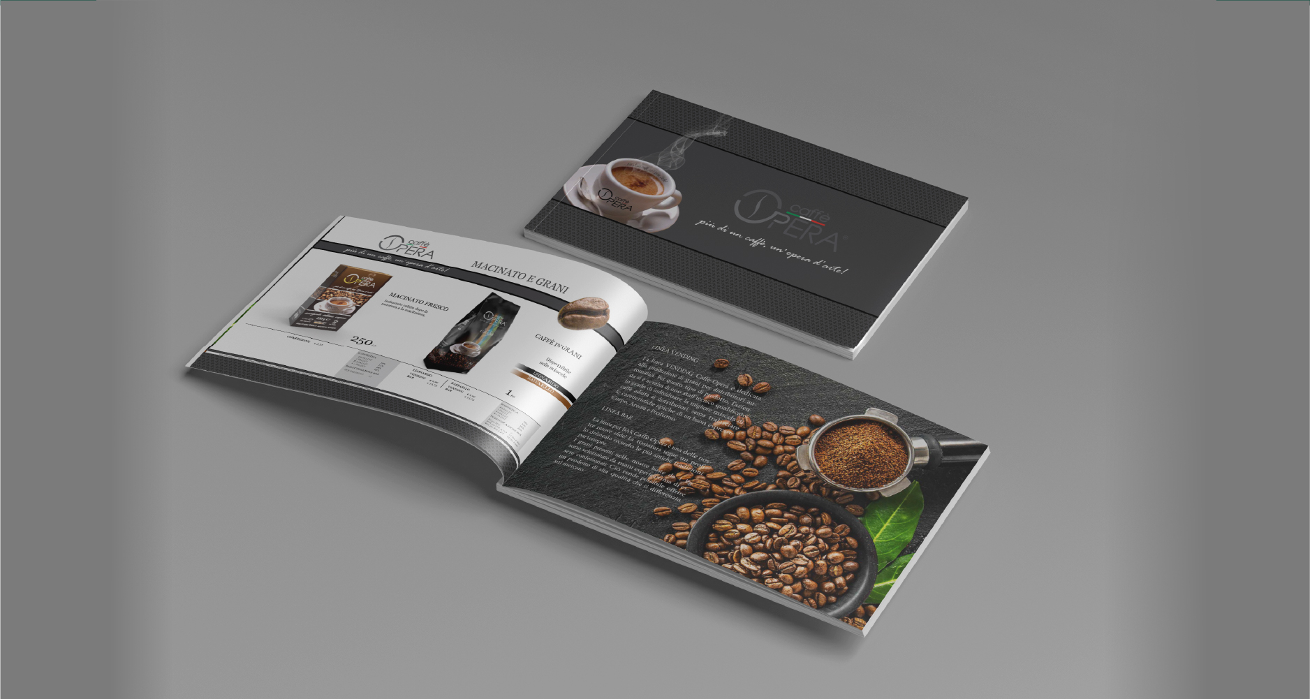
Production of the final catalogue.
The entire visual system was built to ensure consistency, recognizability, and a professional brand image.
Risult
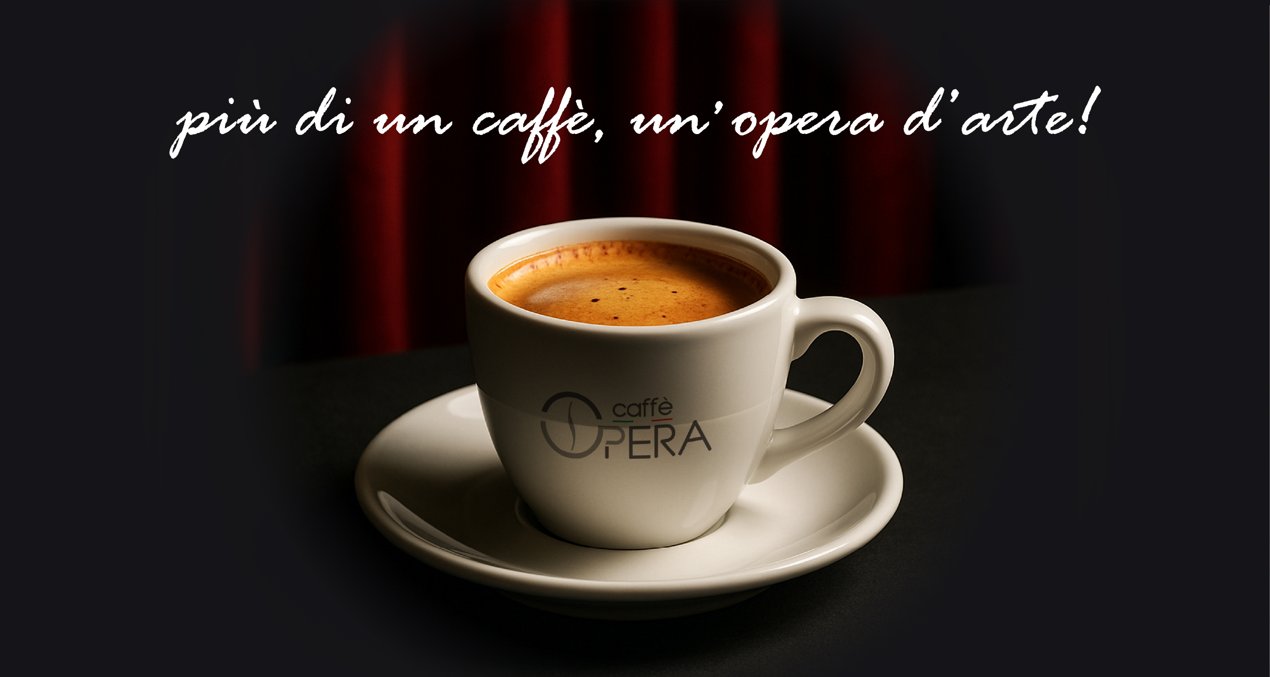
A complete, modern and distinctive visual identity, reflecting the care and quality of Caffè Opera products. The packaging line is immediately recognizable on the shelf and the coordinated image strengthens the brand’s professionalism and reliability.