
KAFFETTERA – Ideazione packaging grafico
Project carried out in collaboration with the MadIdea – Salerno agency
Obiettivo
Carry out the restyling of the packaging image of the Kaffettera line destined for large-scale retail trade, renewing the visual impact on the shelf and strengthening the brand identity through a distinctive graphic language consistent with the naming.
Concept
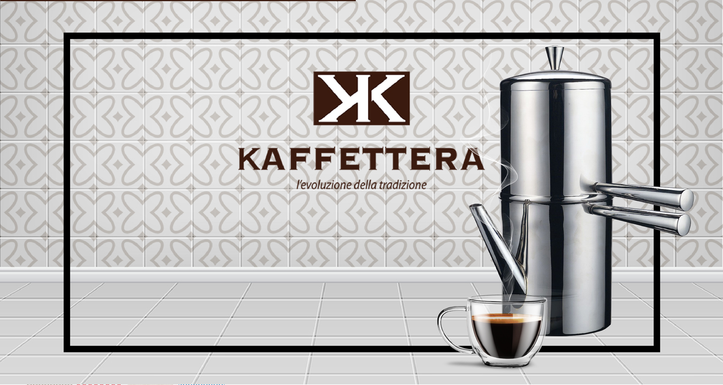
The name “Kaffettera” immediately recalls the tradition of the Neapolitan vending machine, a symbol of Italian coffee culture.
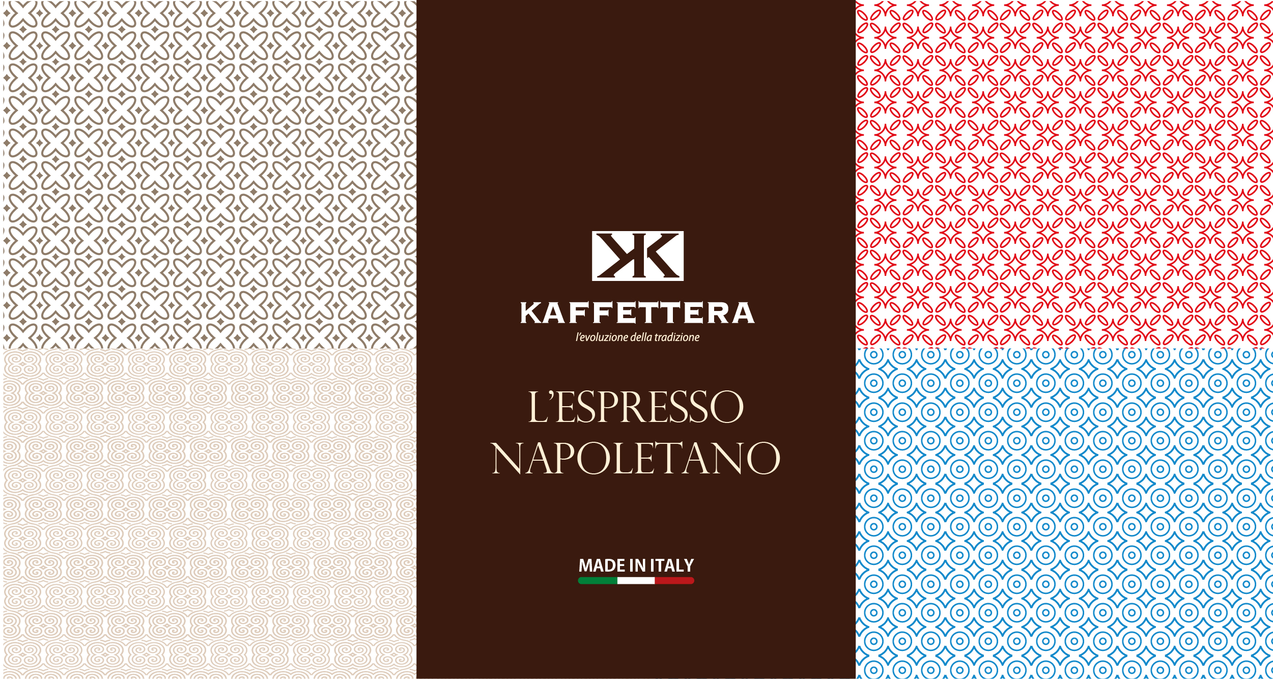
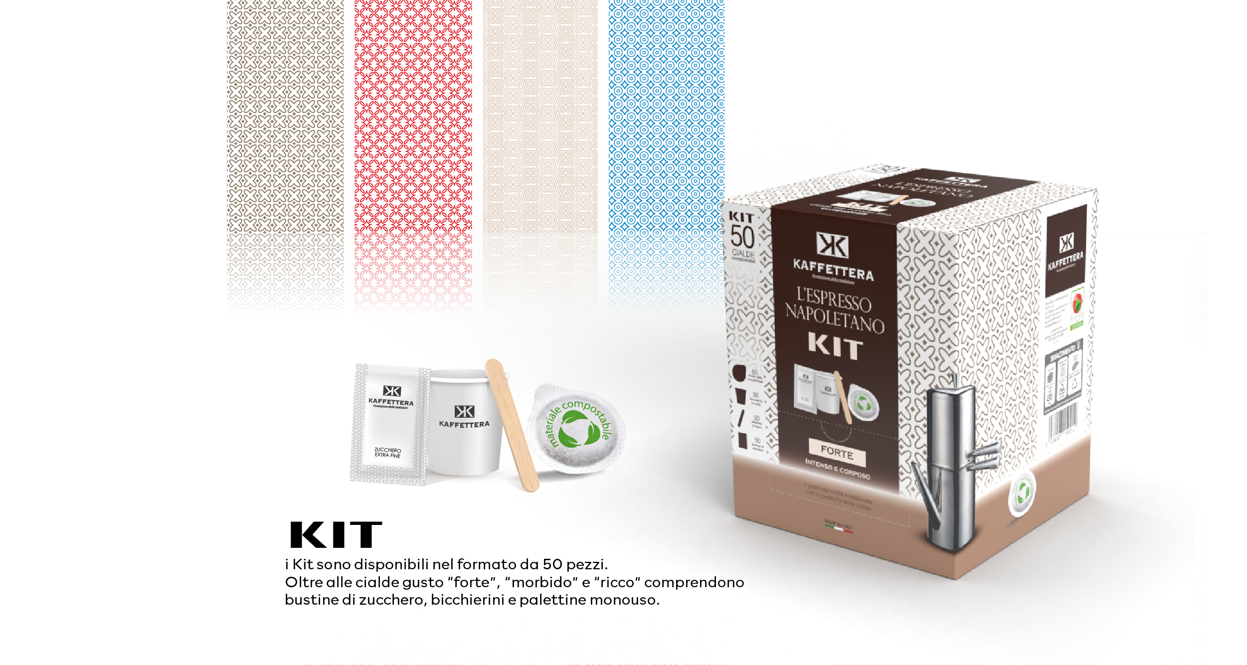
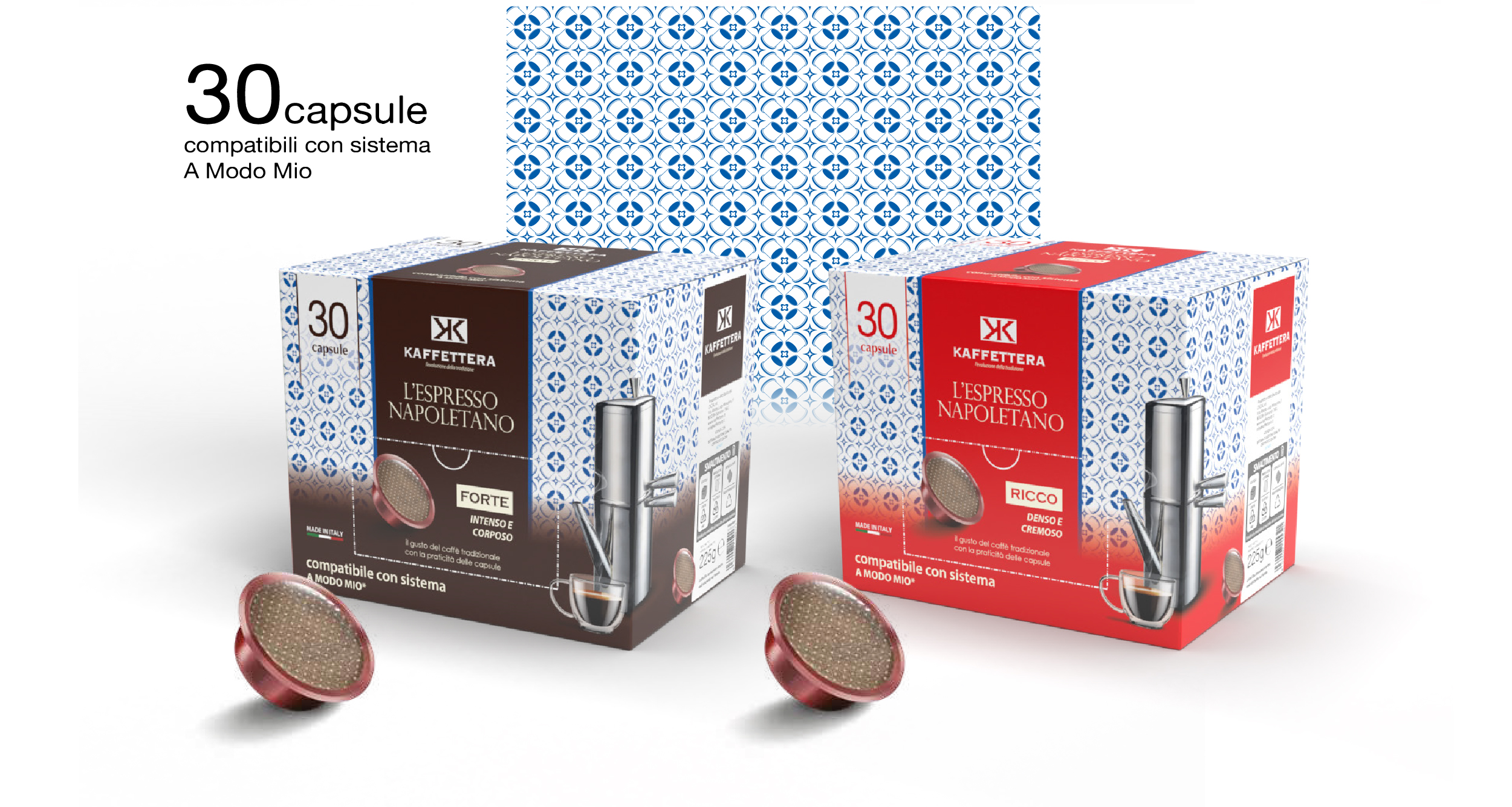
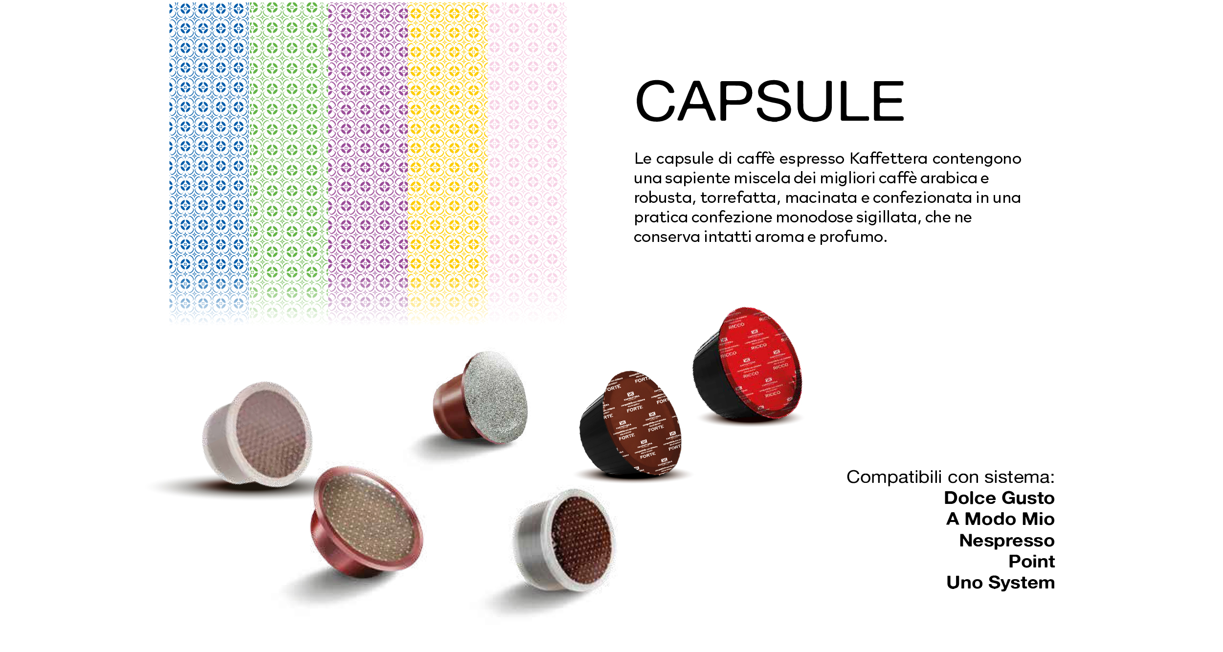
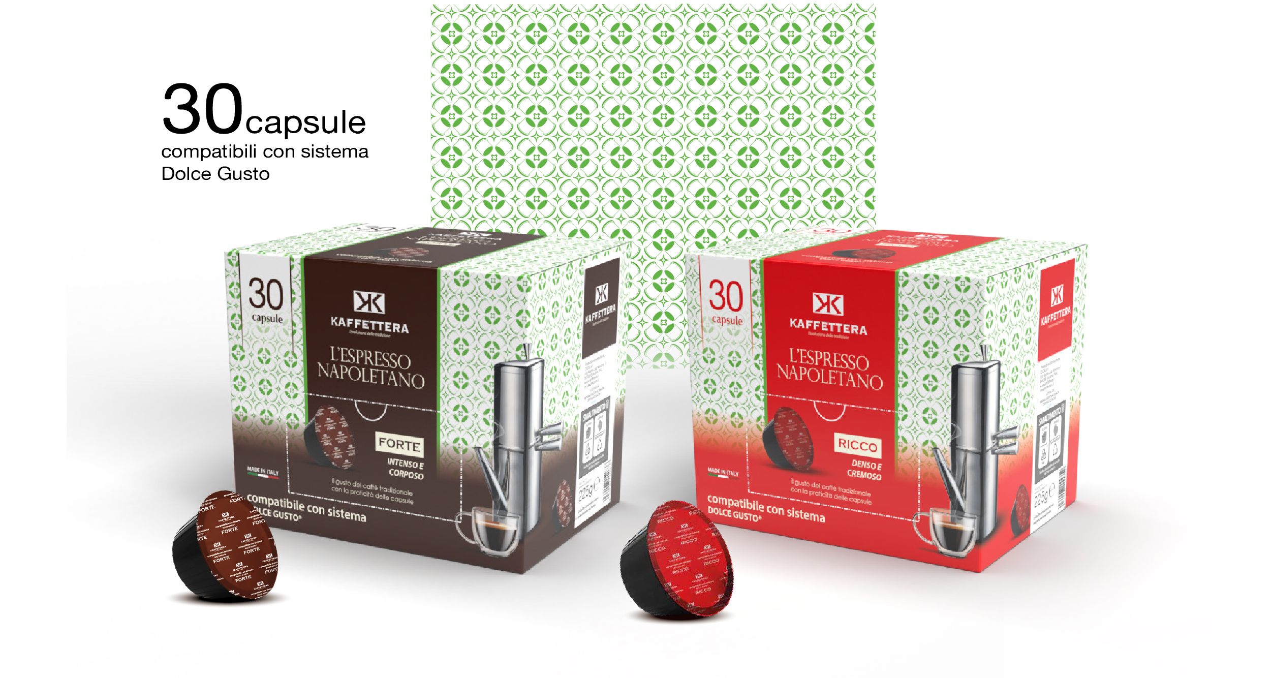
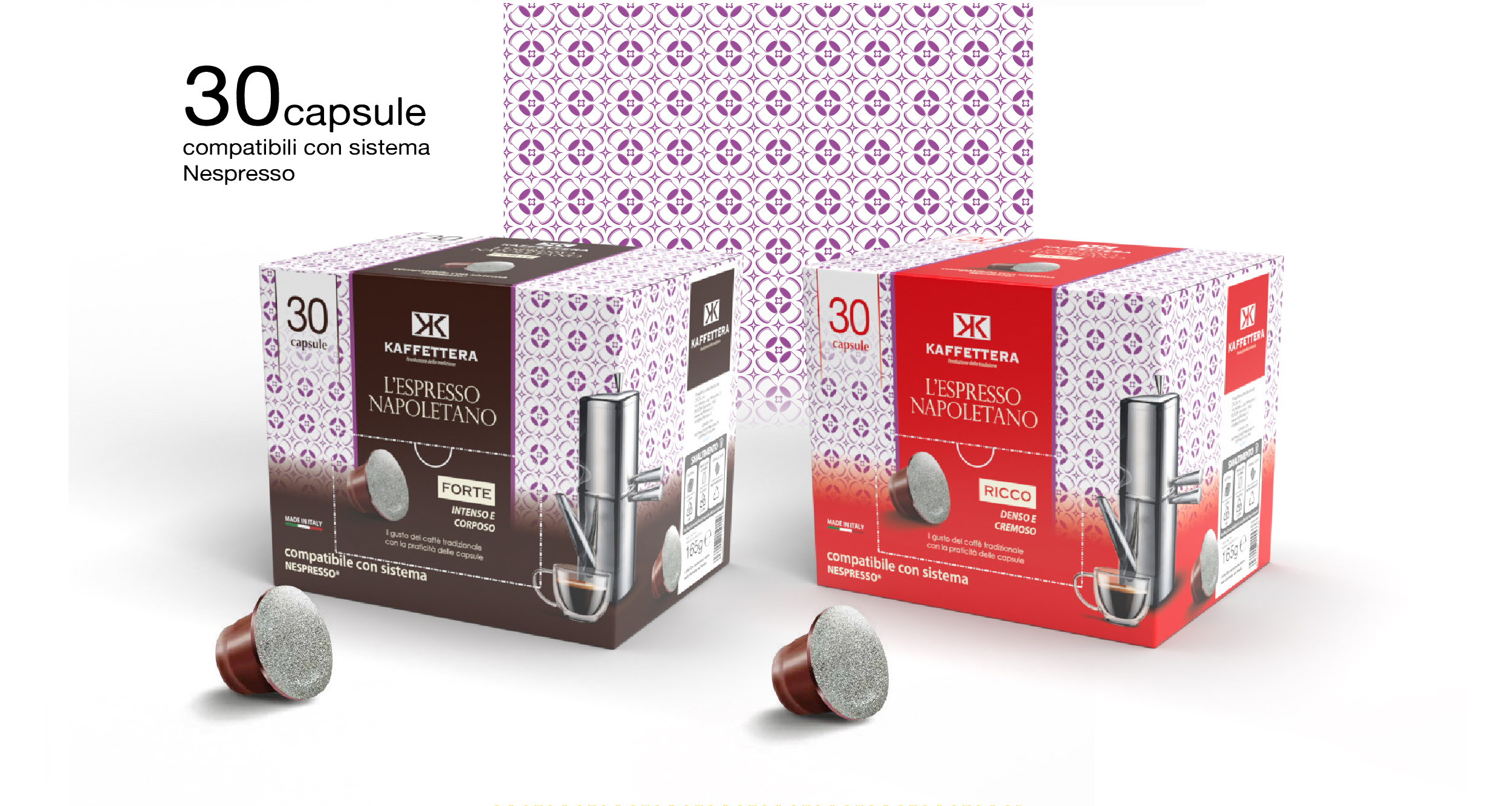
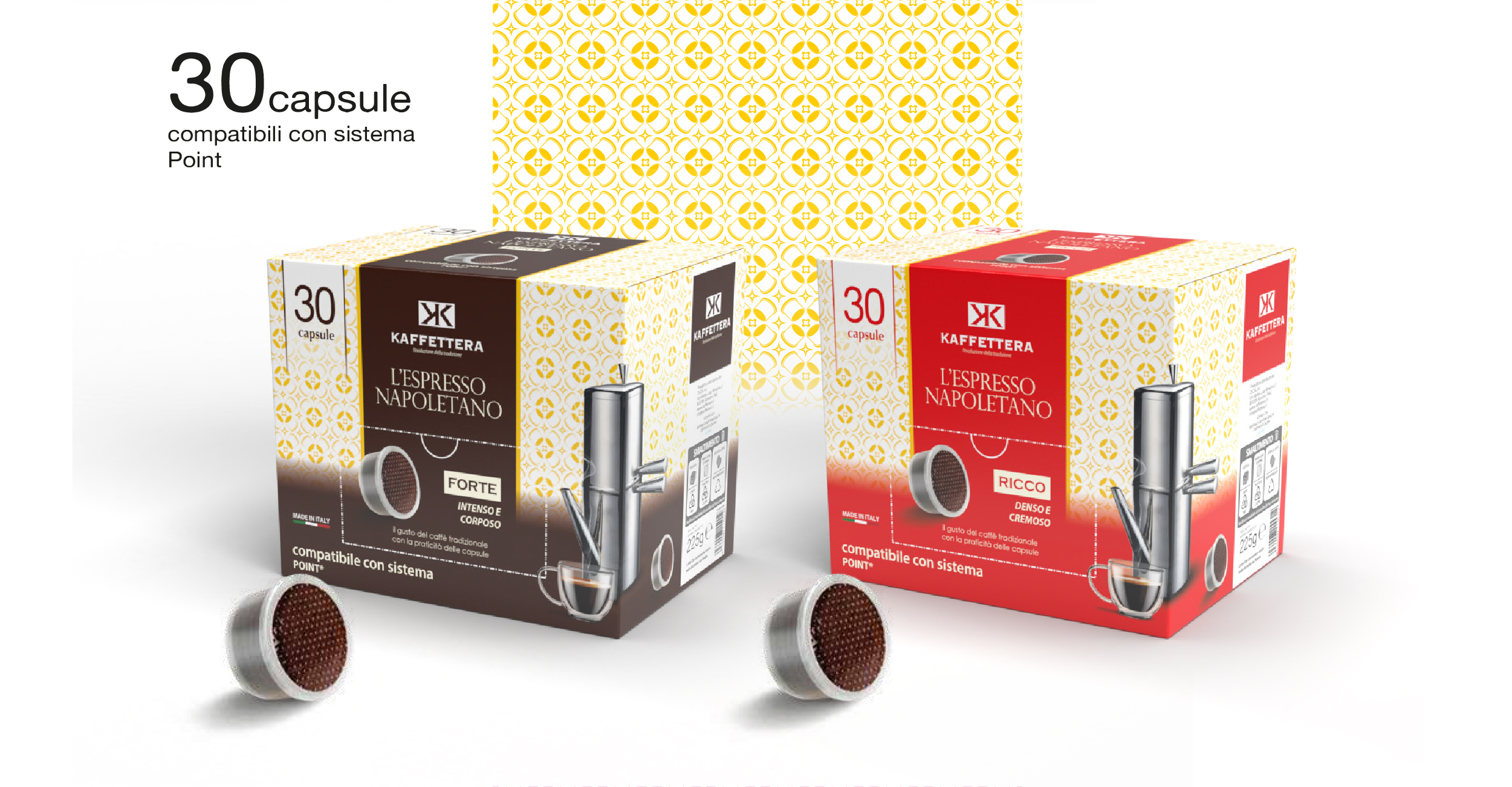
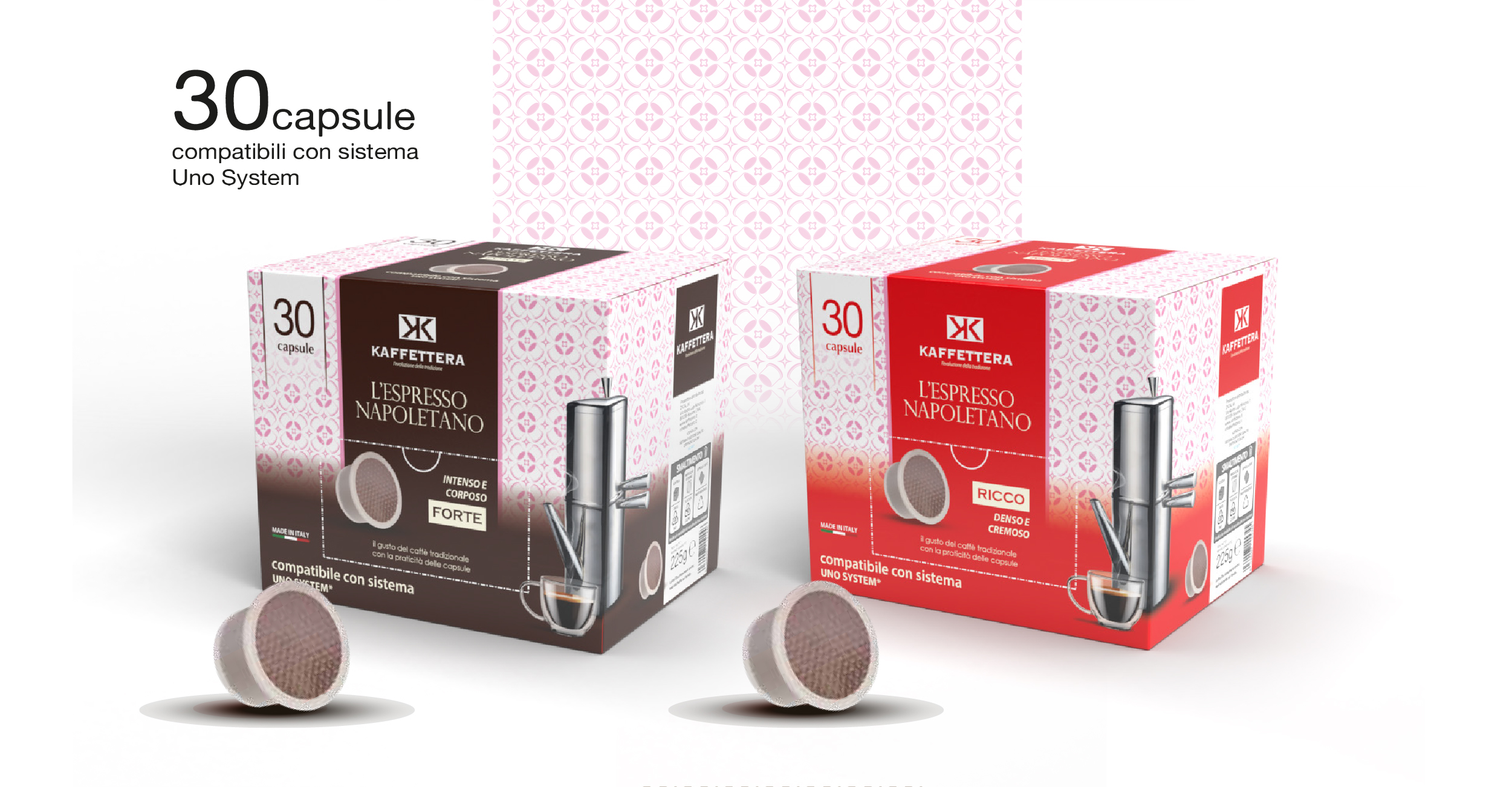
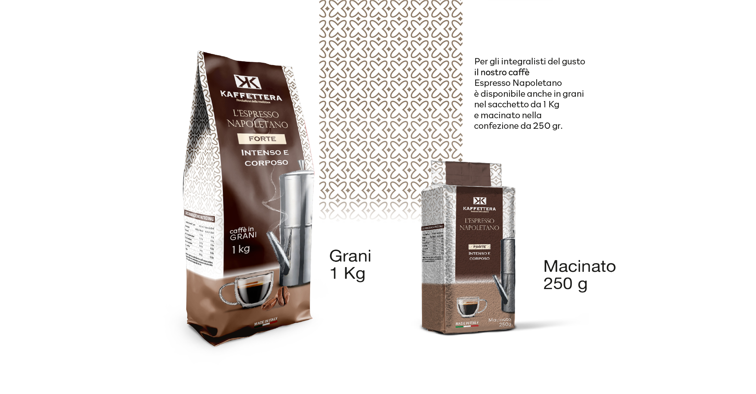
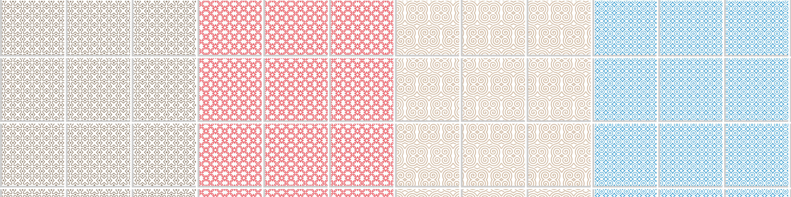
This suggestion gave rise to the idea of evoking the atmosphere of a typical Italian cuisine, a warm and familiar element, in which decorative majolica is an iconic feature. Majolica thus became the distinctive pattern of the line, reinterpreted in a graphic key to characterize the different mixtures.
Sviluppo
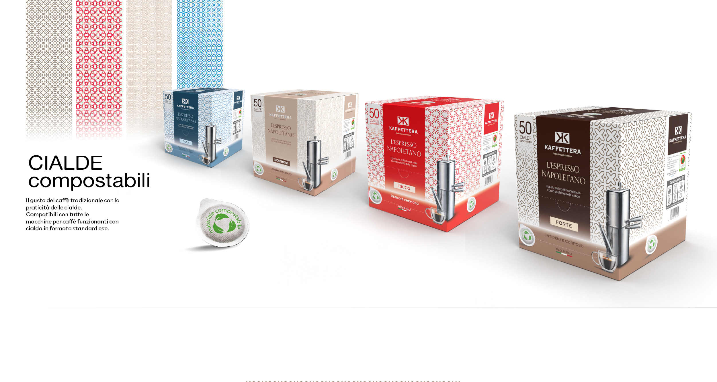
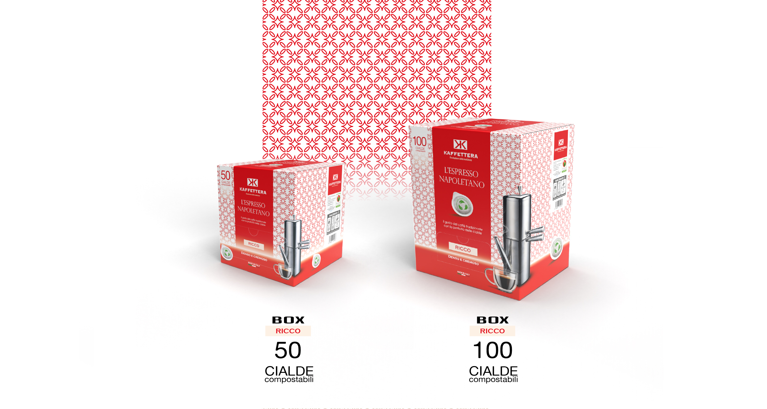
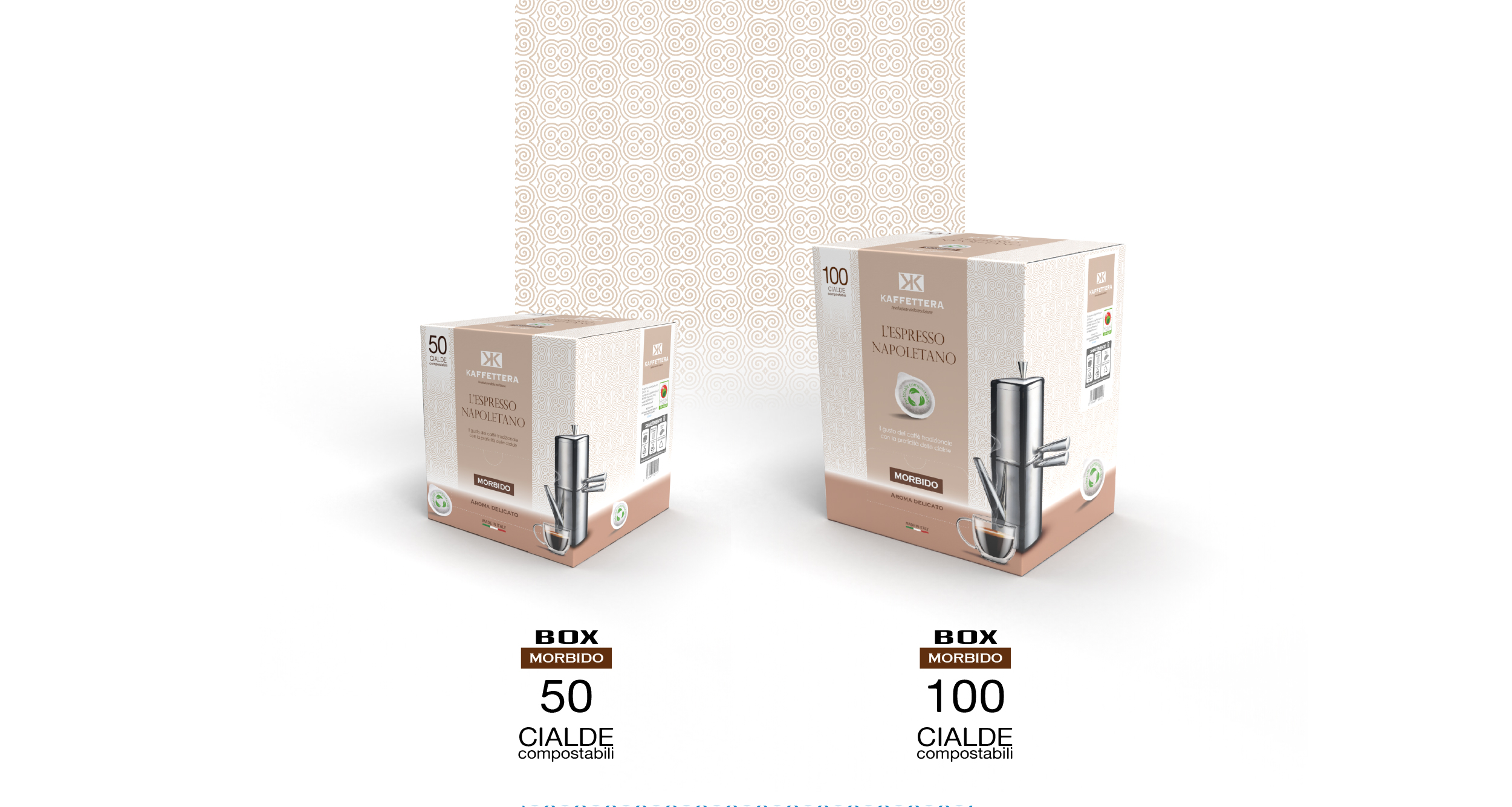
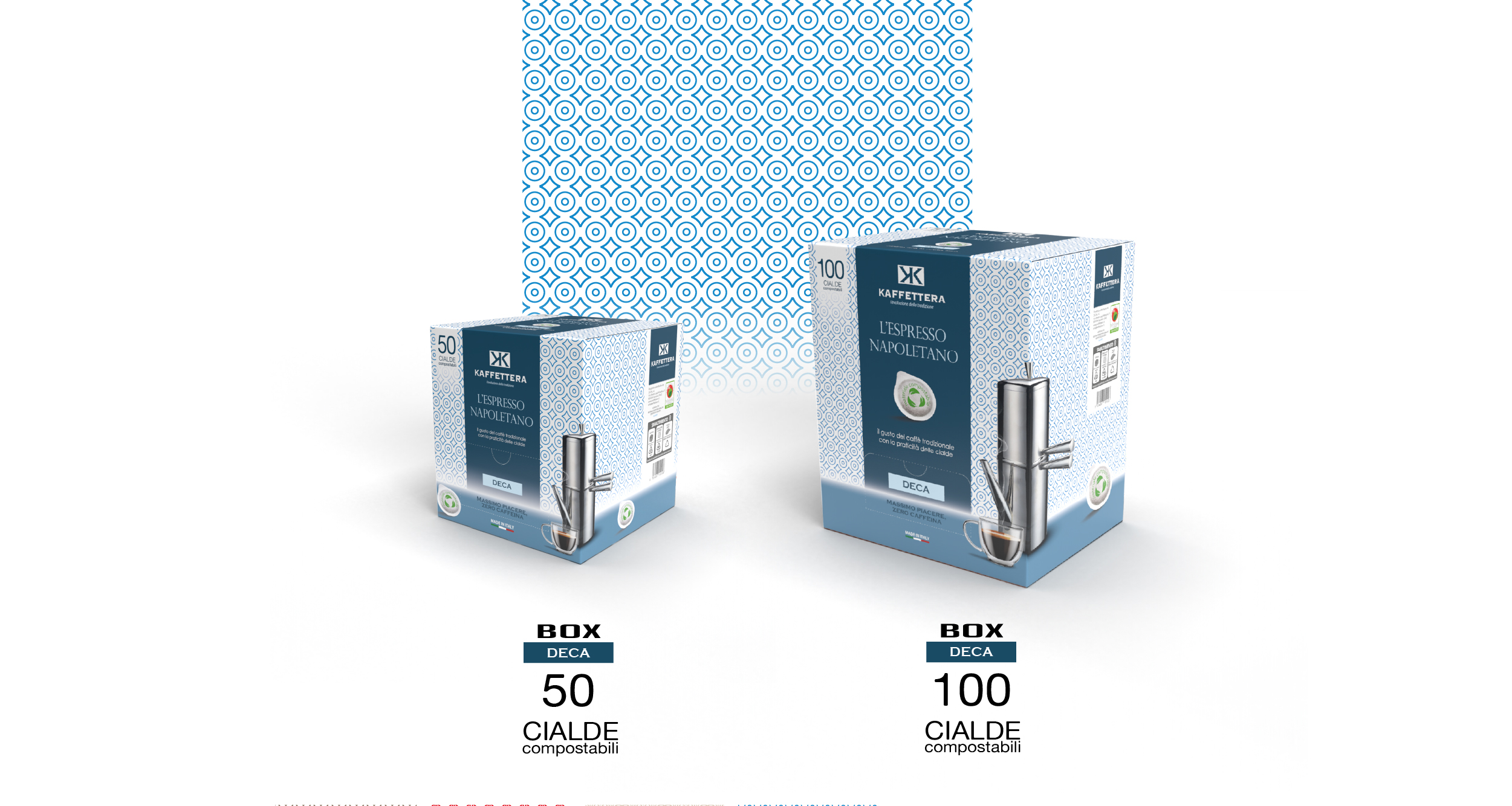
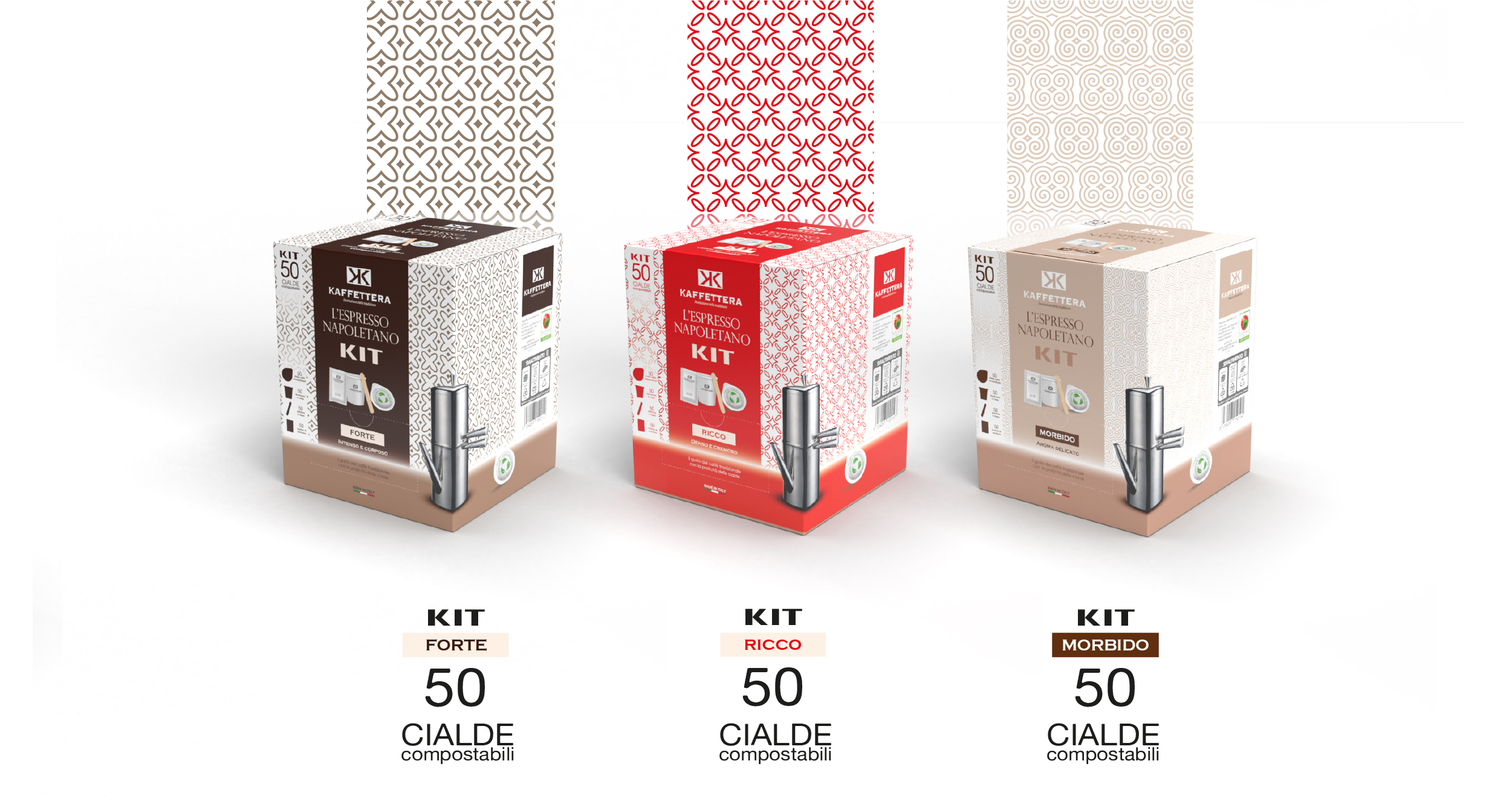
The majolica-inspired pattern was declined to identify the four product variants: Rich, Strong, Soft, and Deca.
Chromatic differentiation was studied to create an immediate association between color and blend intensity:
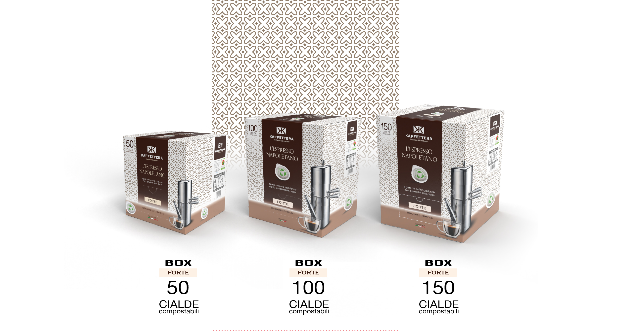
Brown – Strong
Red – Rich
Beige – Soft
Blue – Deca
This choice allowed us to build a clear, coherent and easily recognizable visual system on the shelf.
Risultato
A restyling capable of enhancing the connection with Italian tradition through a contemporary aesthetic. The new packaging strengthens brand identity, improves variant readability, and ensures a distinctive presence in the competitive context of large-scale retail trade.