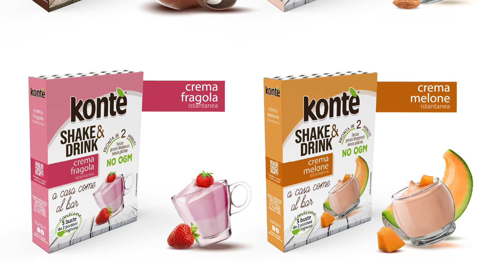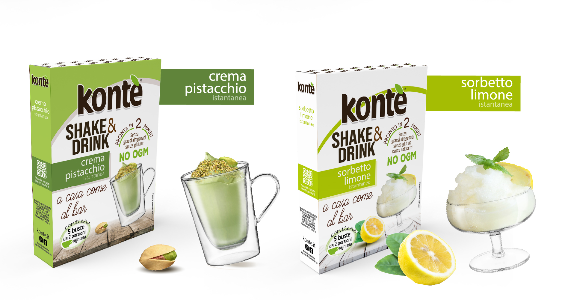

Packaging SHAKE&DRINK
Each project is born from listening carefully to the client’s needs and analyzing the target market. My goal is to transform corporate values, vision, and identity into a coherent, distinctive, and strategic visual language.
Below is the creative path developed for this project, from the initial idea to the final result.
Obiettivo
Define and develop the visual identity of a young and dynamic brand, specialized in the distribution of soluble preparations in capsules compatible with the main systems (Dolce Gusto, Nespresso and A Modo Mio), as well as in pods and bulk format for hot and cold drinks intended for the bar and home sector.
The goal was to communicate freshness, modernity and innovation, in line with brand positioning.
Concept
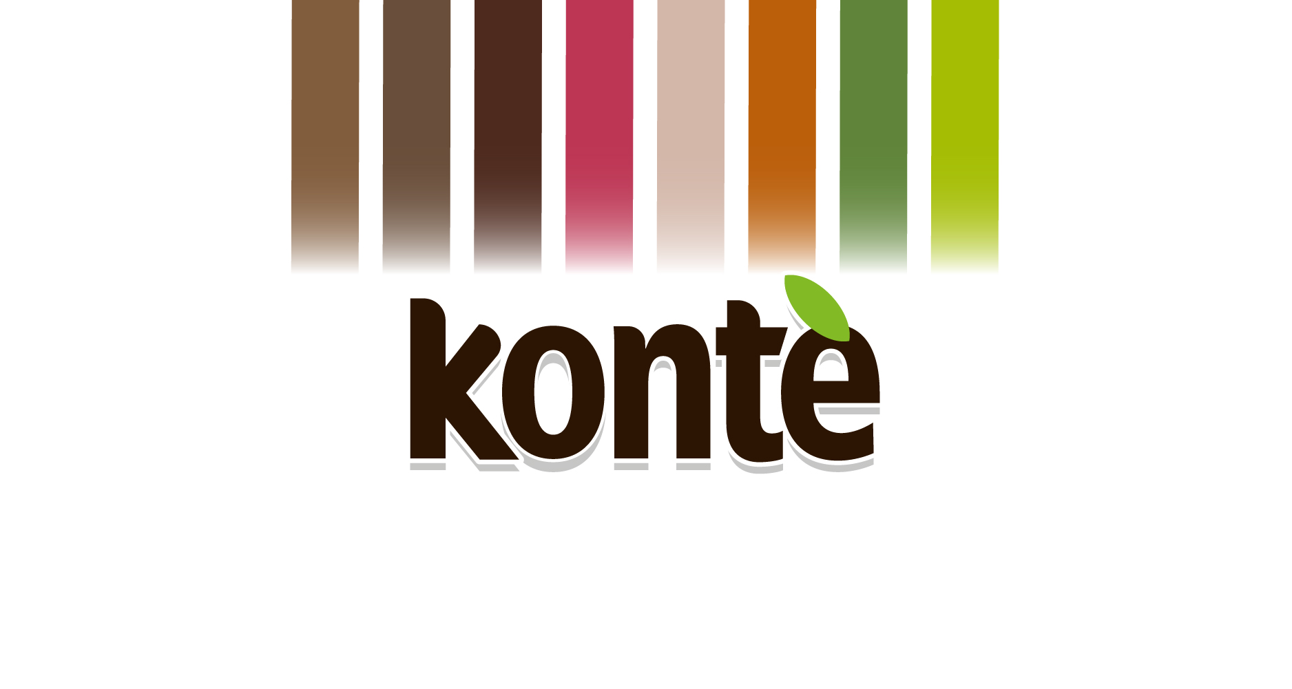
The logo was designed with a direct, modern and essential style, capable of conveying immediacy and contemporaneity. Visual identity arises from the need to represent a young, versatile brand oriented towards an audience attentive to new consumer trends.
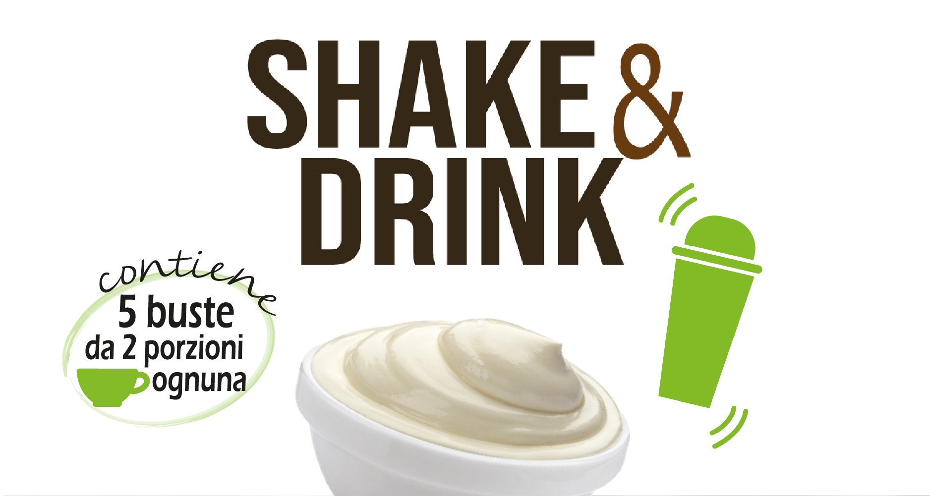
For the SHAKE&DRINK line, the concept focused on the idea of freshness, taste and dynamism, highlighting a range of delicious, creamy and fruit drinks.
Development
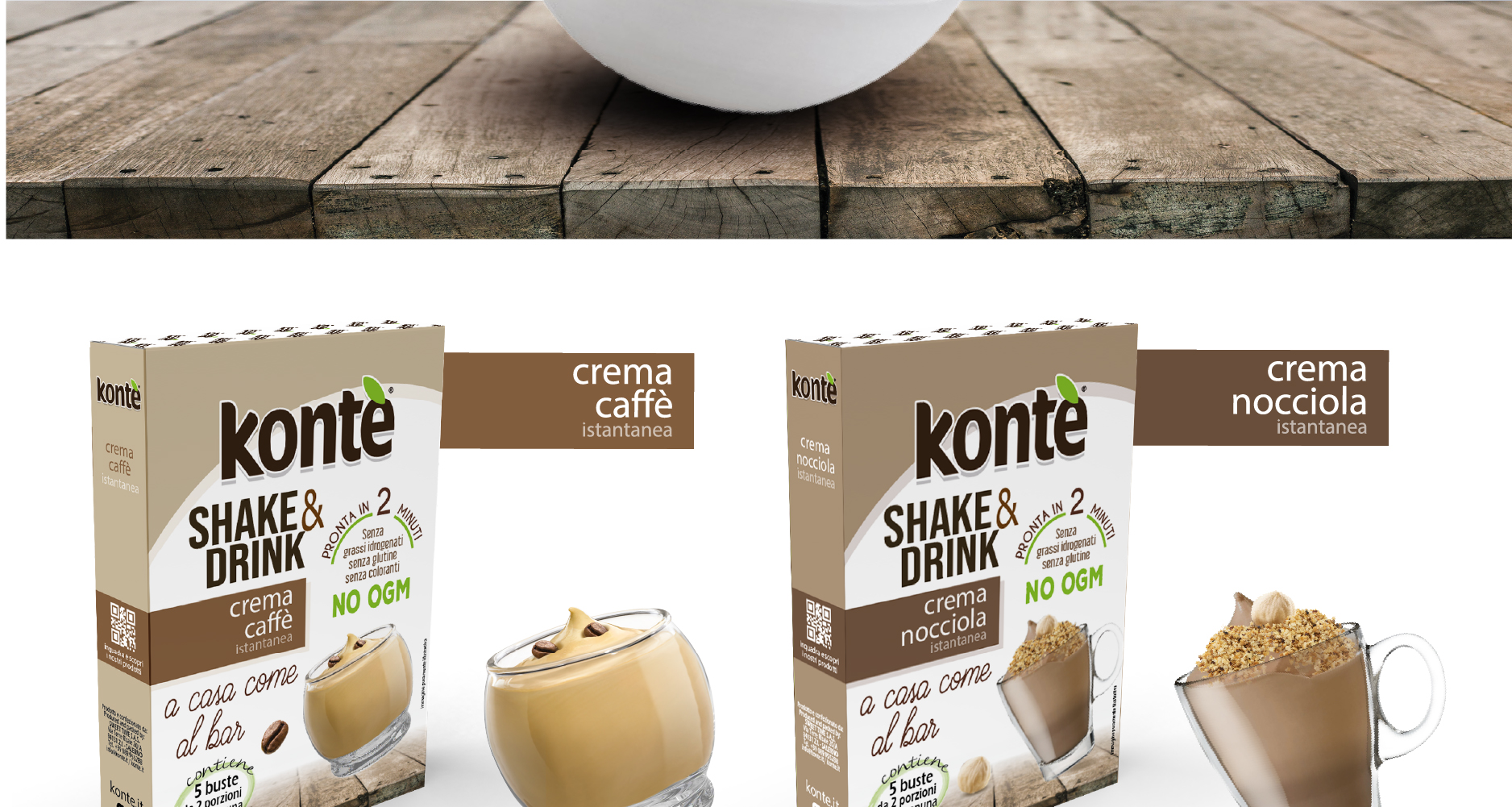
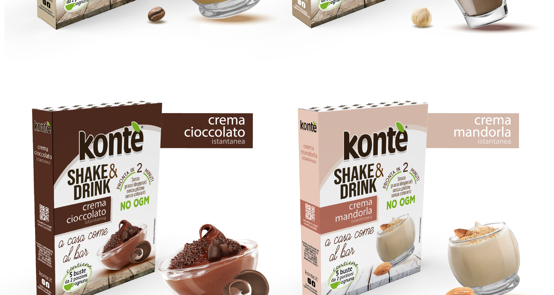
Starting from the distinctive elements of the logo and the brand’s visual language, I developed the packaging graphics by translating the company’s values into a design characterized by bright colors, soft lines, and rounded shapes.
The graphic setting was designed to draw attention to the shelf, maintaining visual coherence and strong line recognizability.
Risultato
A consistent and attractive packaging system, capable of communicating energy, freshness and modernity. The SHAKE&DRINK line stands out for its visual impact and personality, strengthening Kontè’s positioning as an innovative brand in the soluble beverage sector.
All products of the Kontè line are listed on the website Konte.it