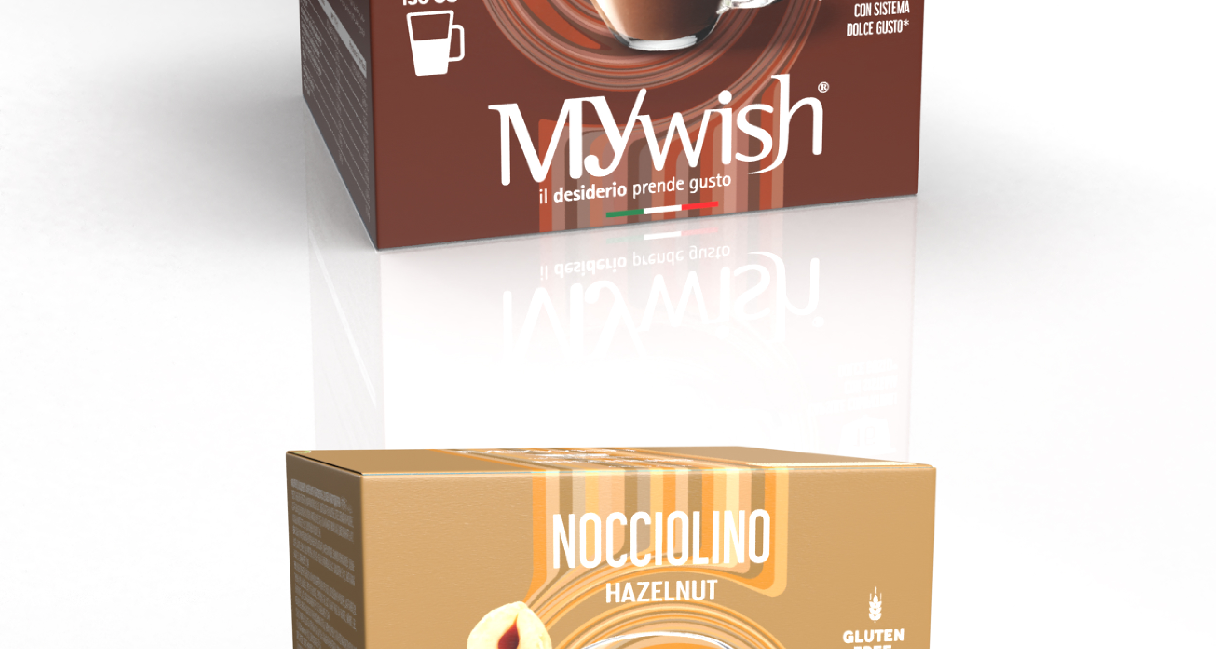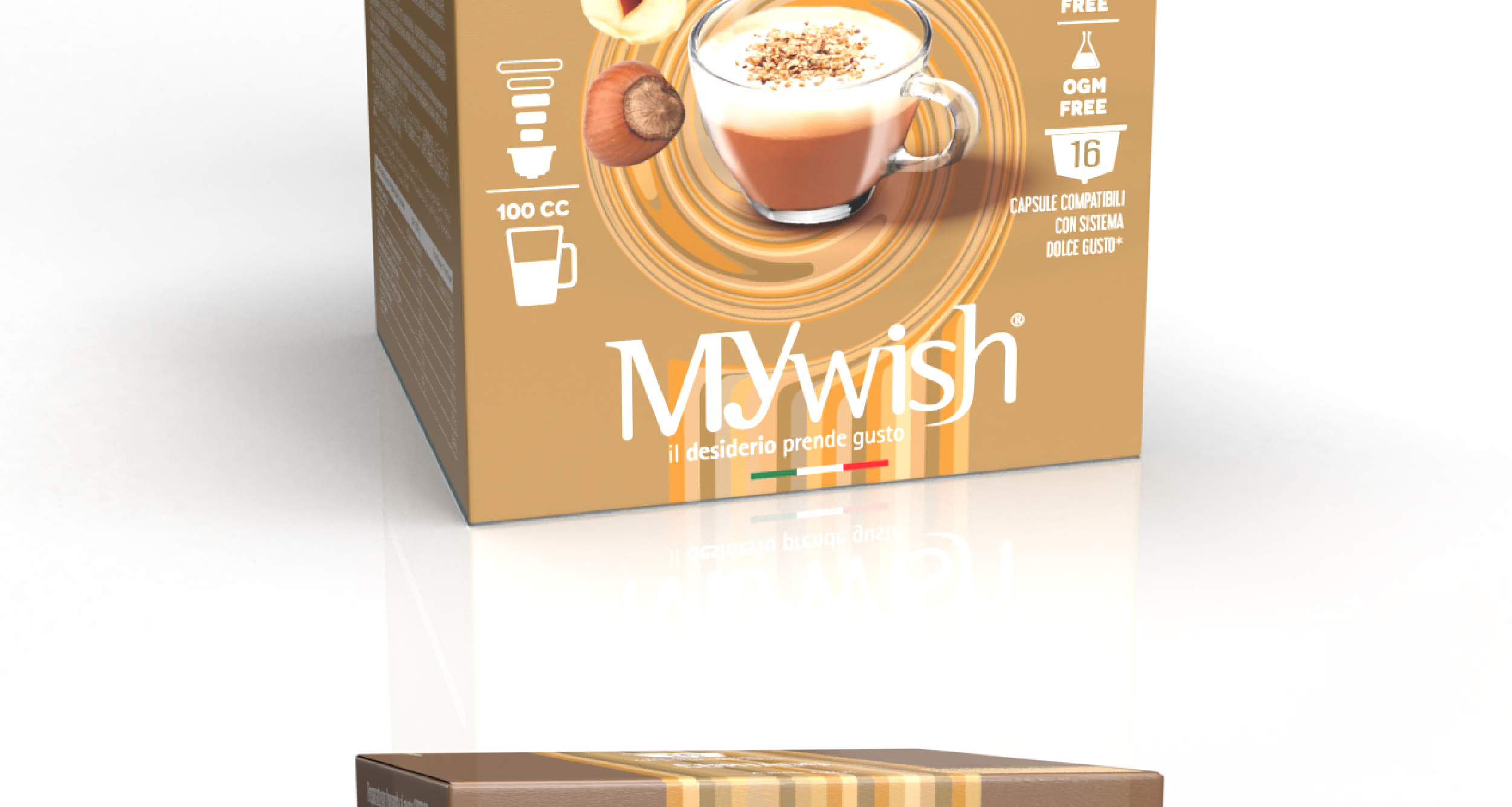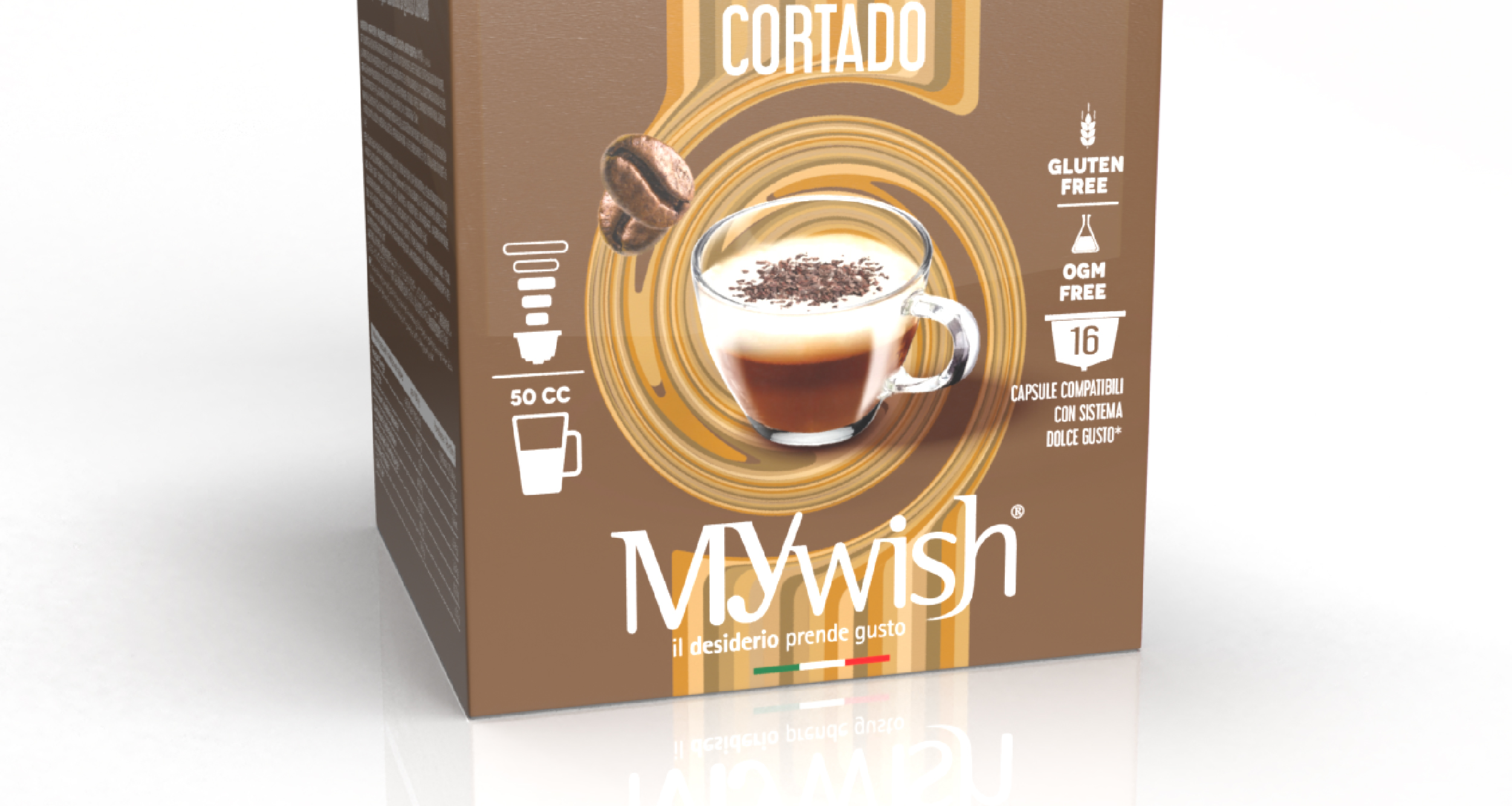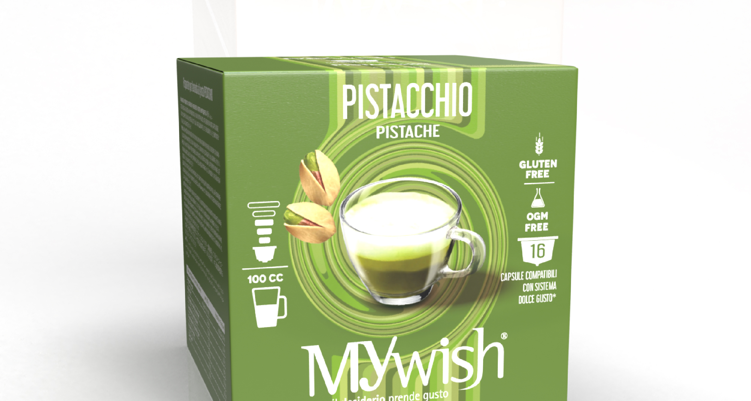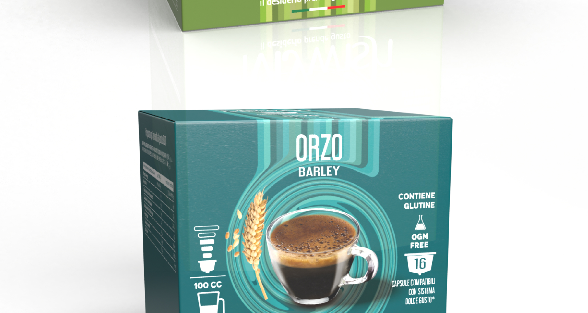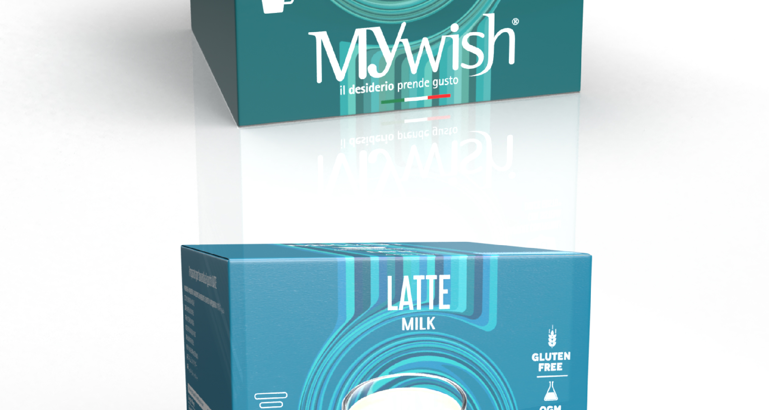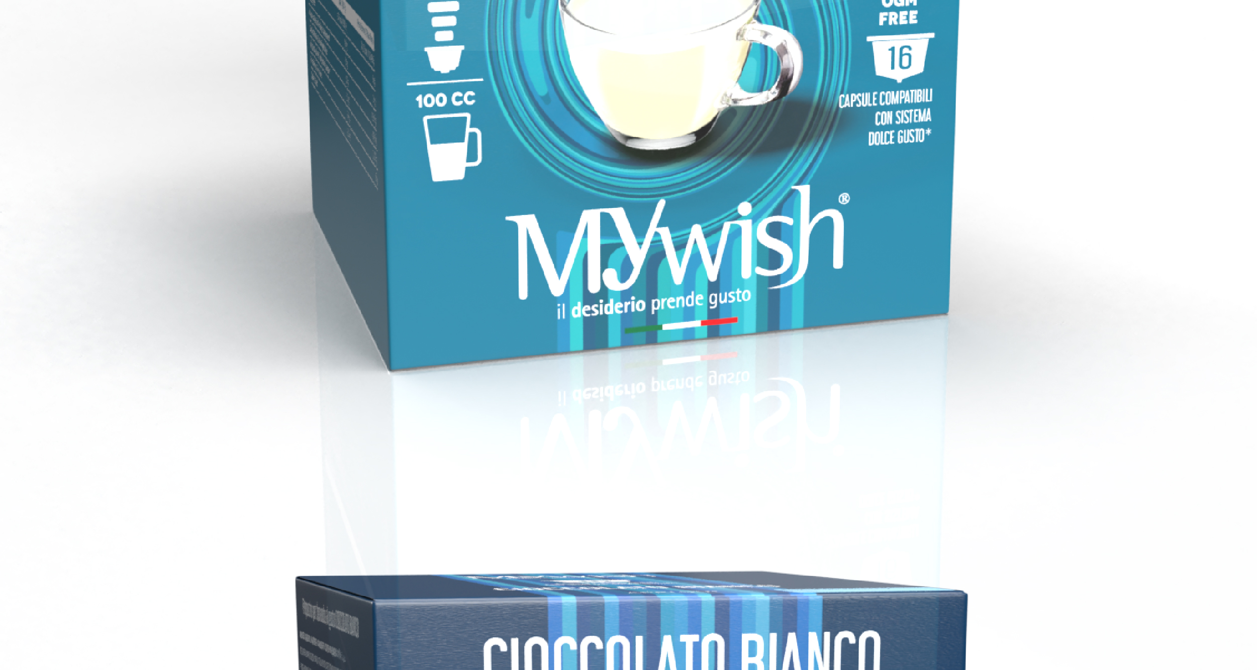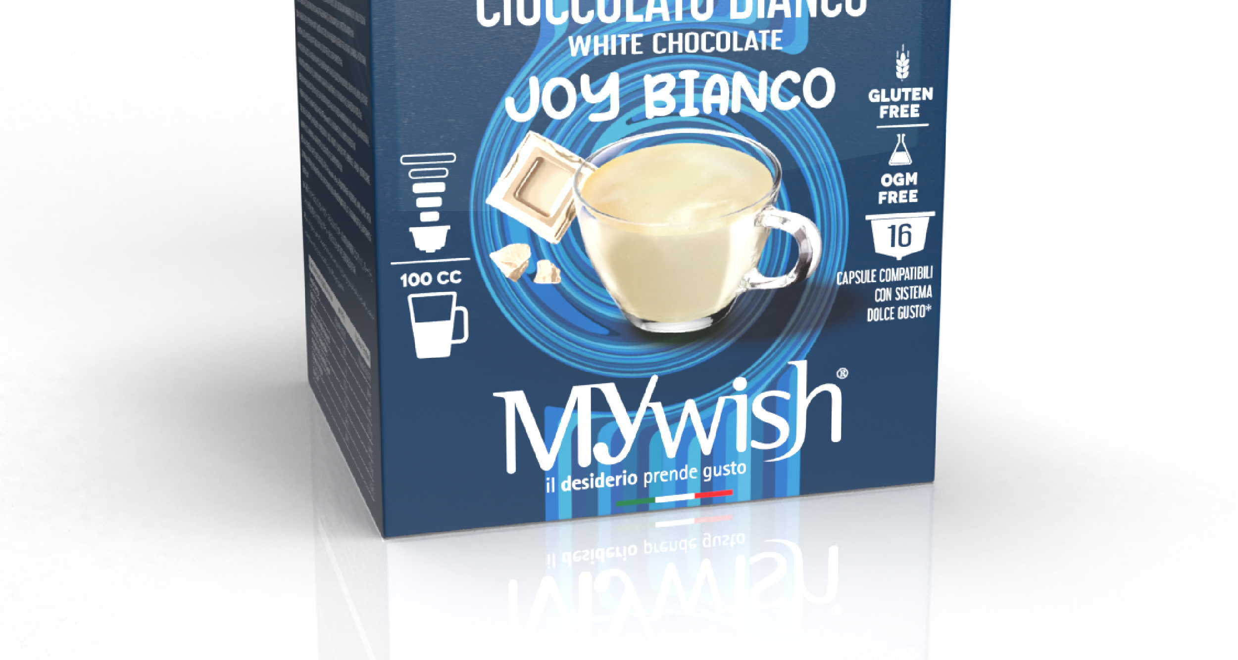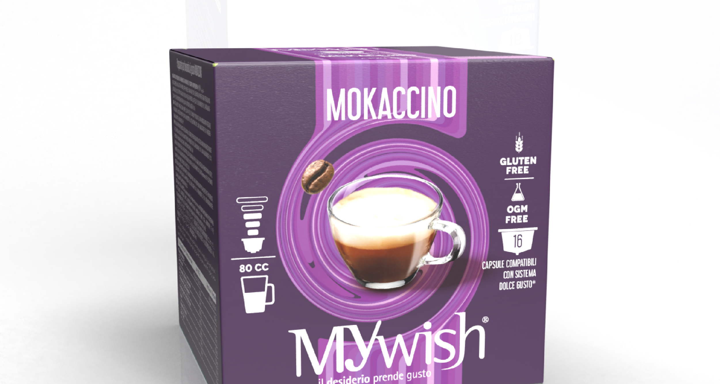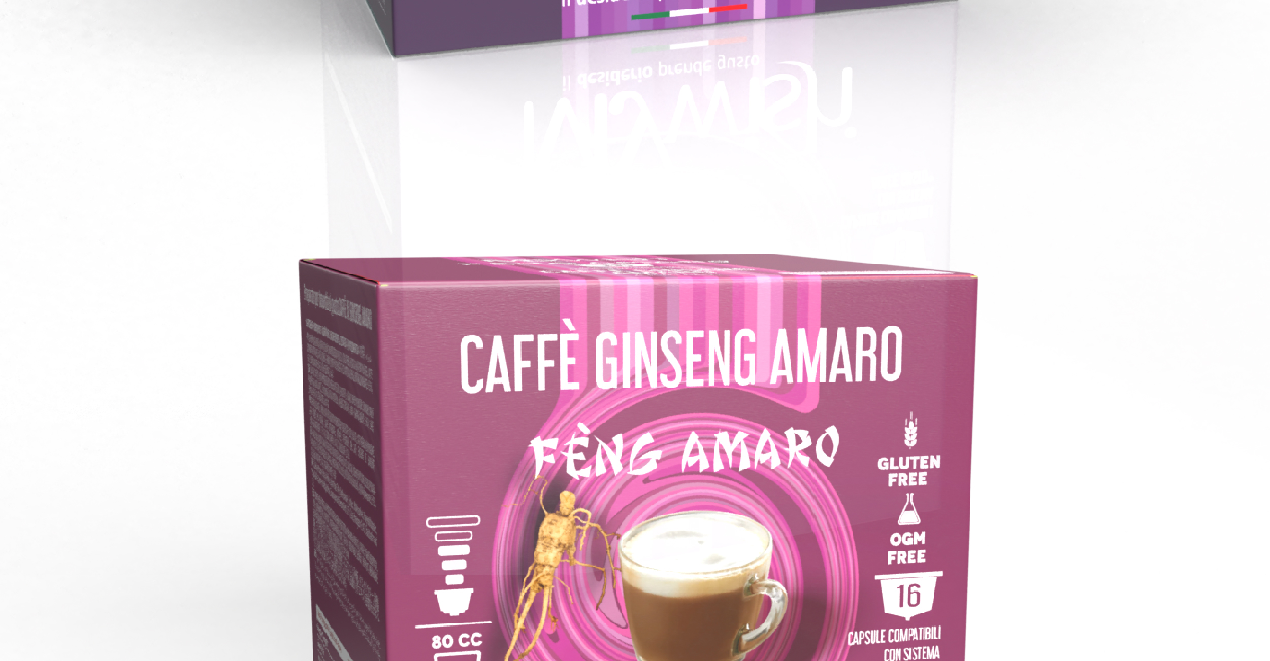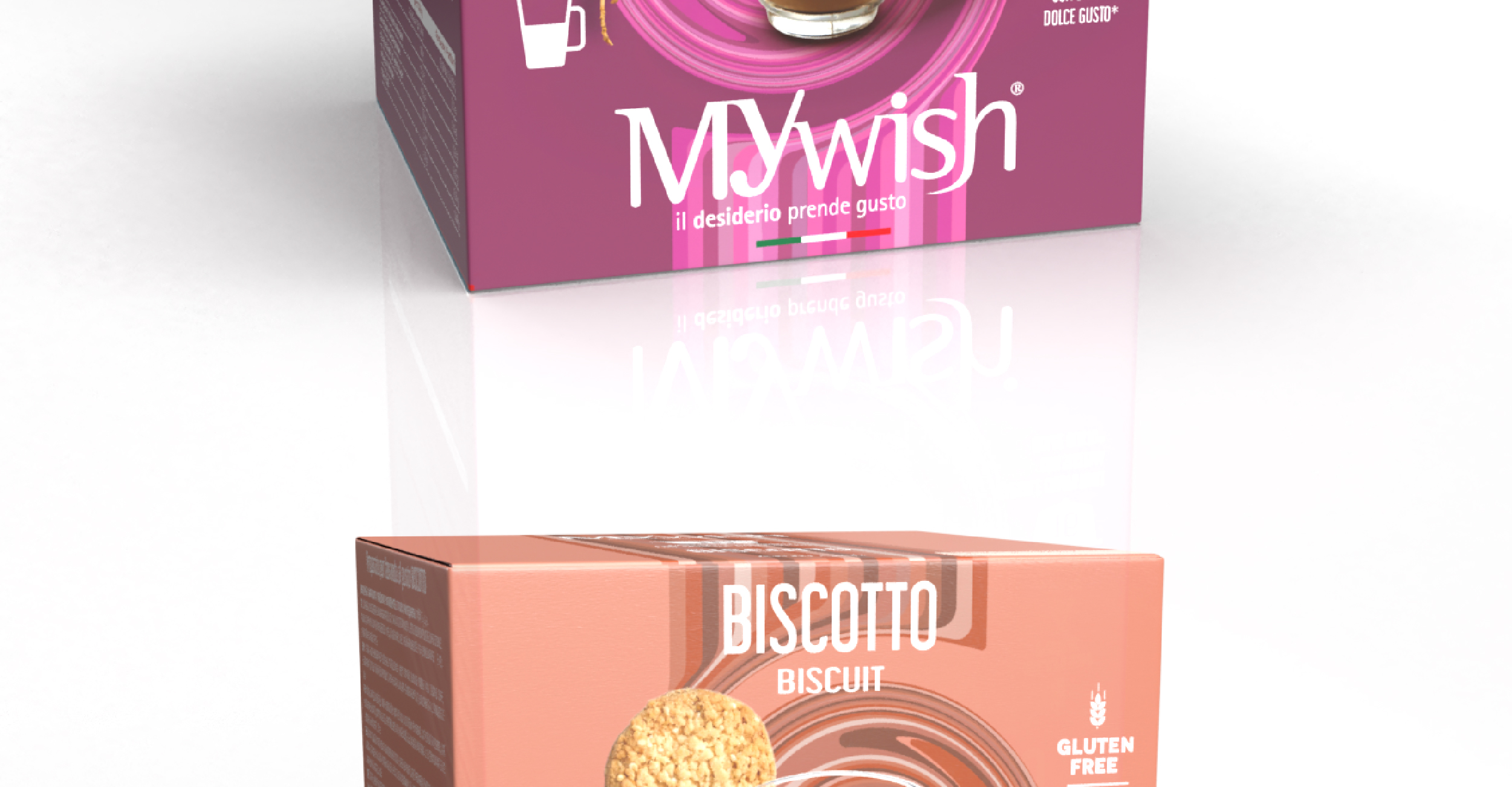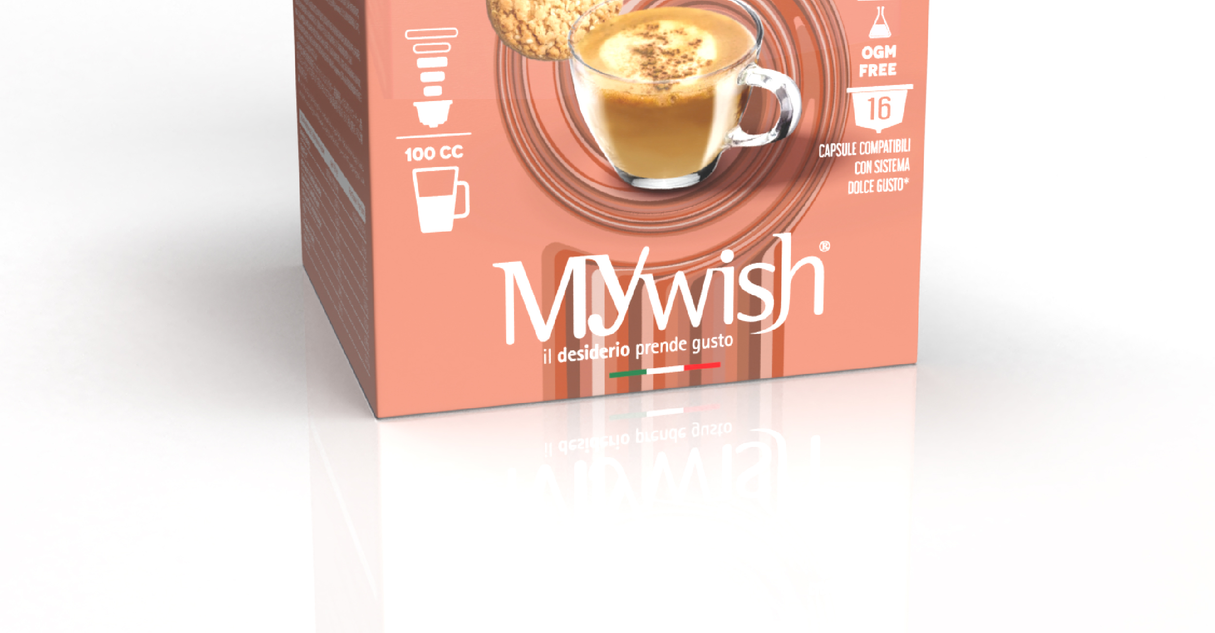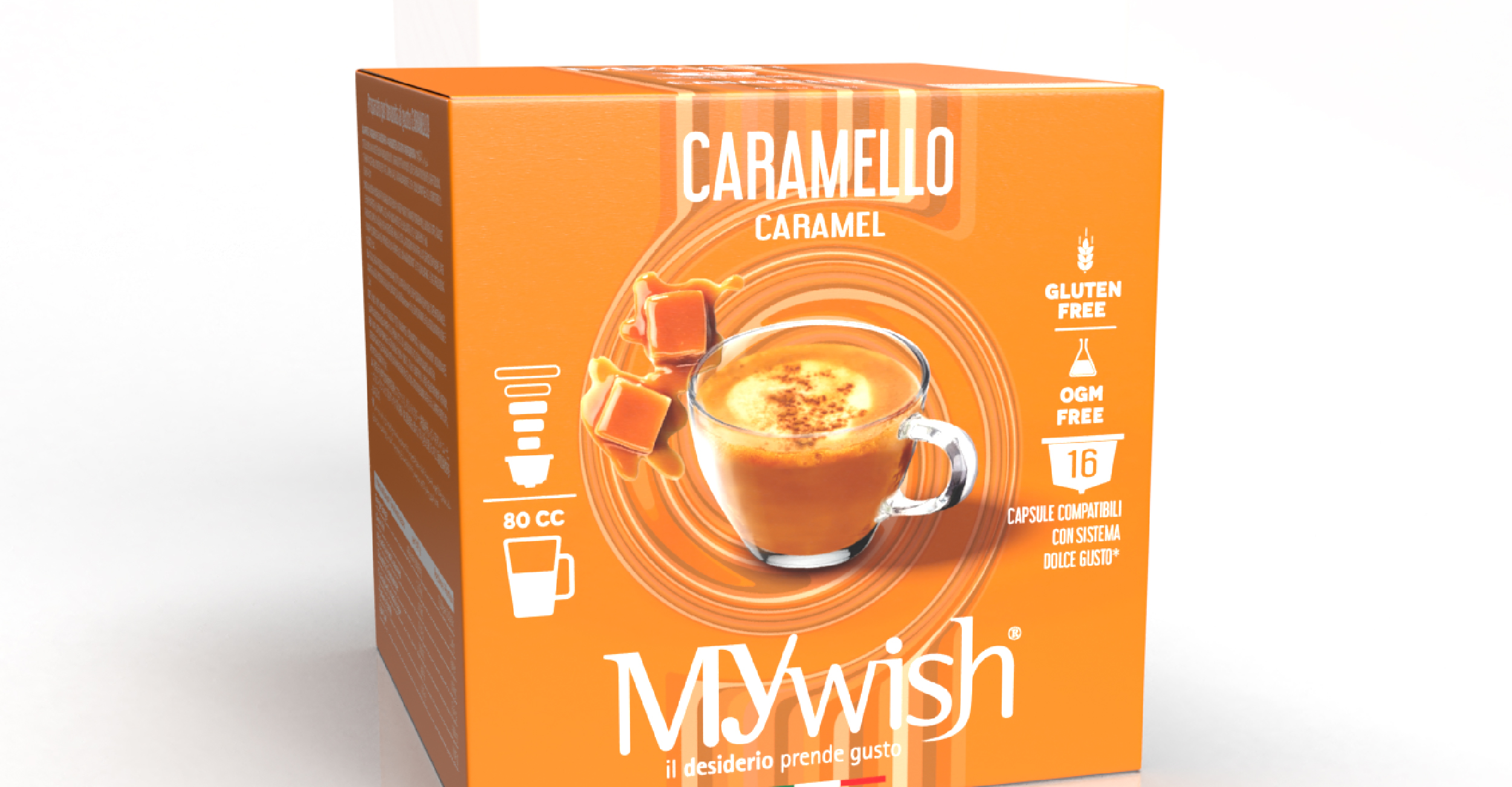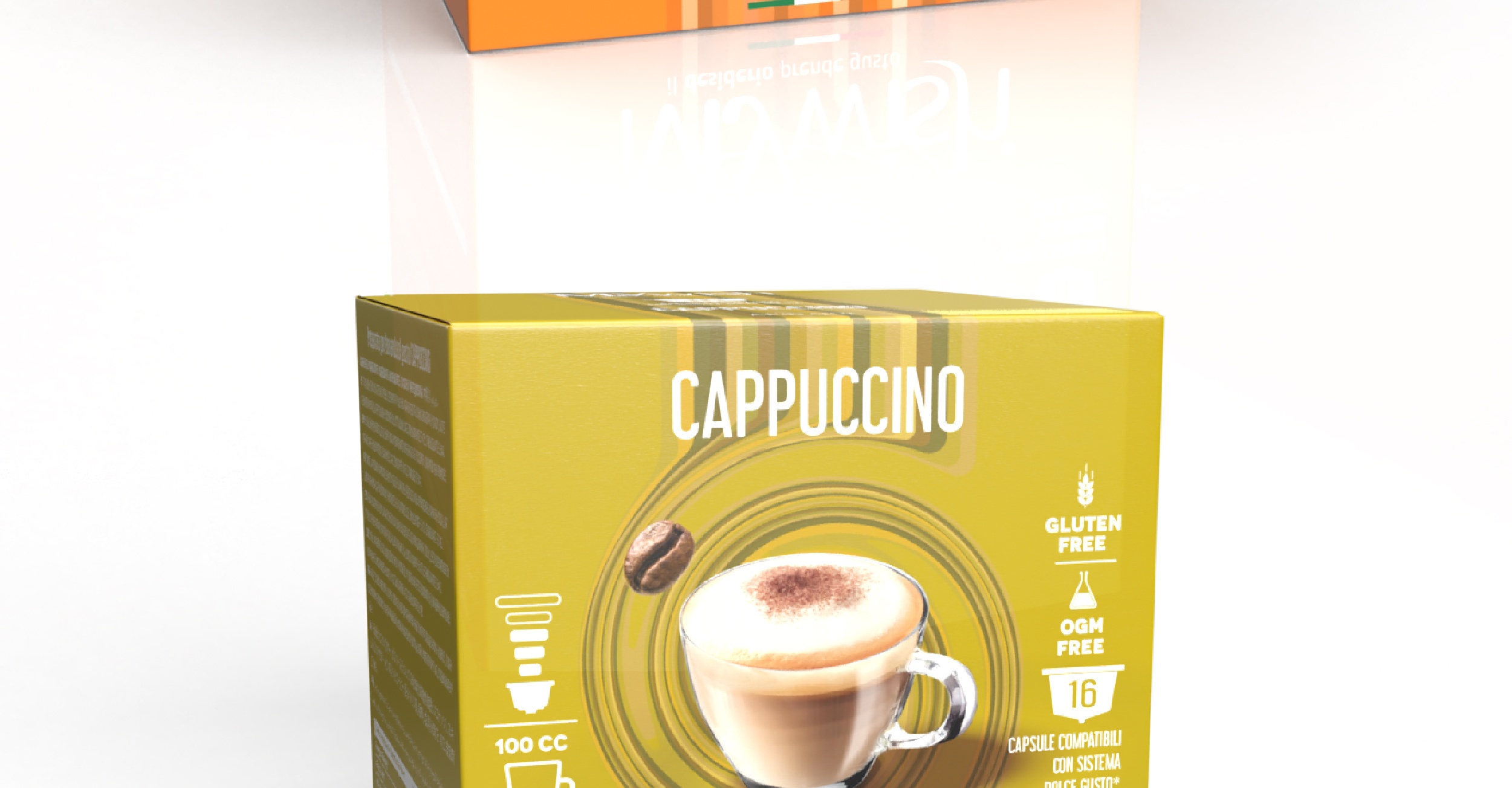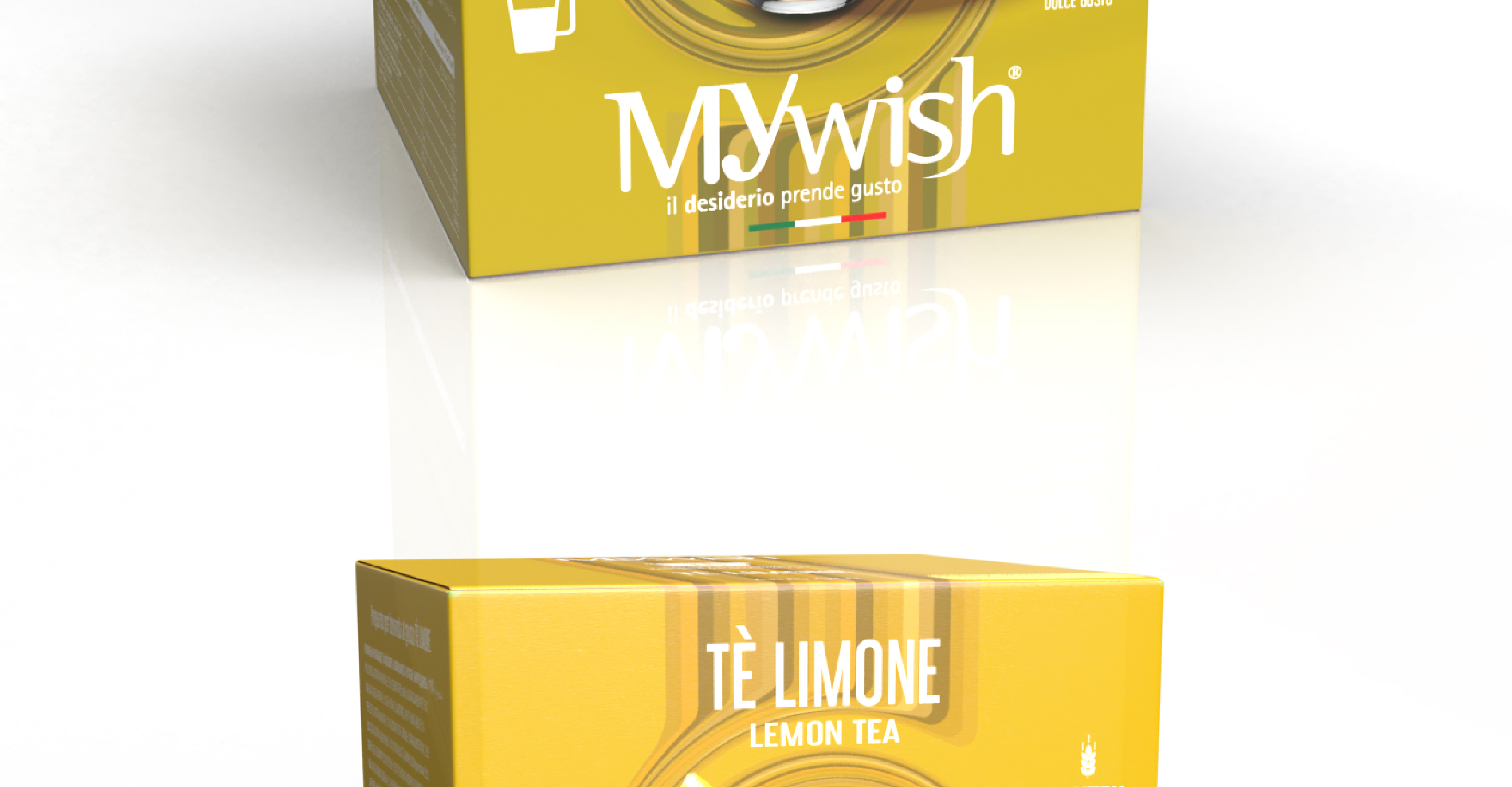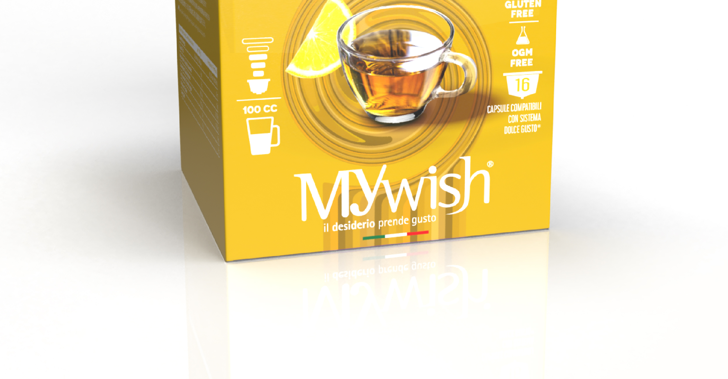

Packaging project for soluble line Dolce Gusto capsule boxes.
Goal
Carrying out the redesign of the packaging for the line of soluble products in capsules compatible with the Dolce Gusto system, with the goal of increasing shelf impact and making the brand stand out from competitors on the market. Concept
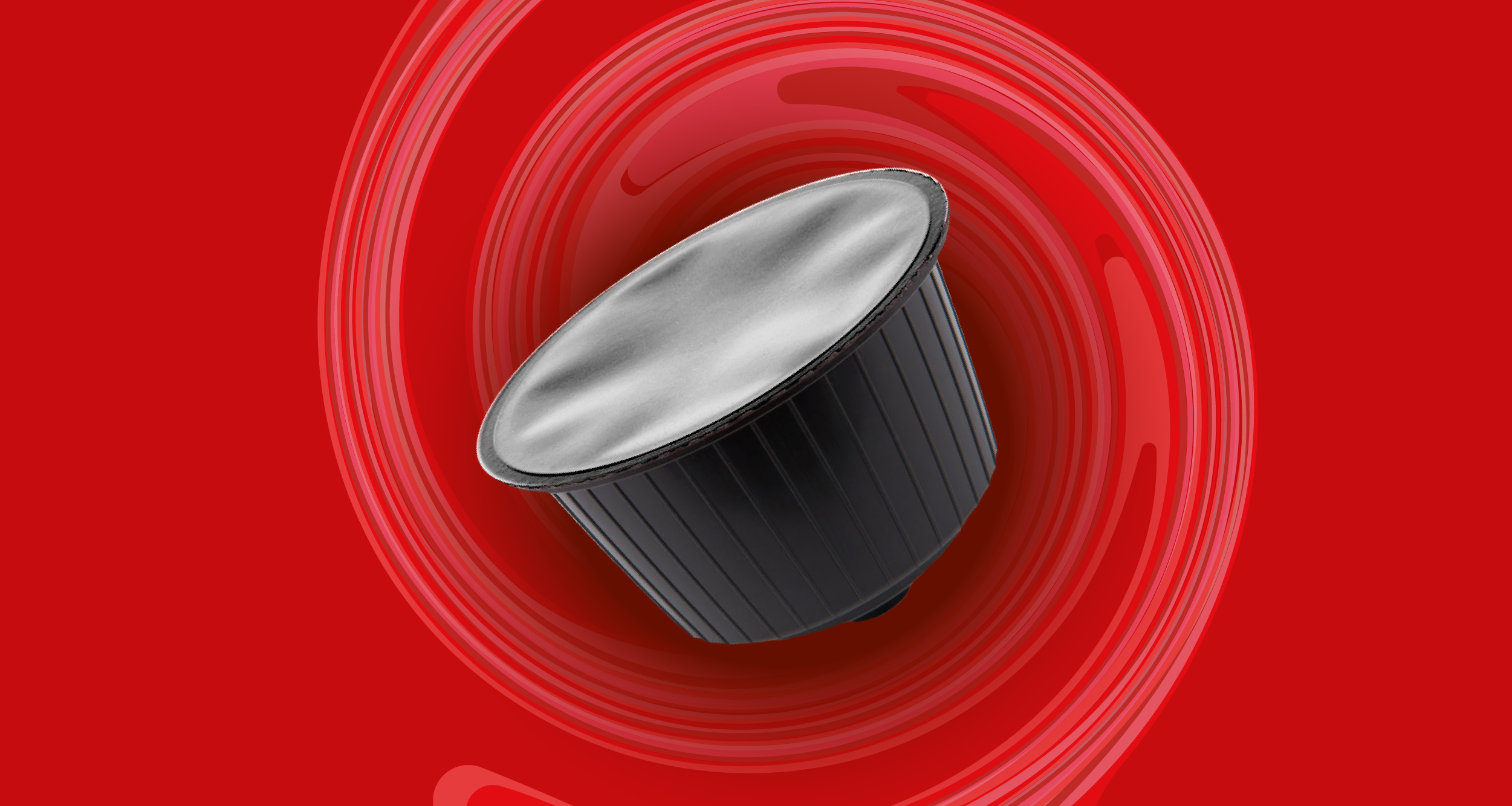
The creative core of the project is movement. The dominant element of the graphics is a vortex, a dynamic symbol that visually evokes the flow of the drink as it is poured into the cup.
The idea is to turn a daily moment – preparing the drink – into a distinctive and memorable graphic element.
Development
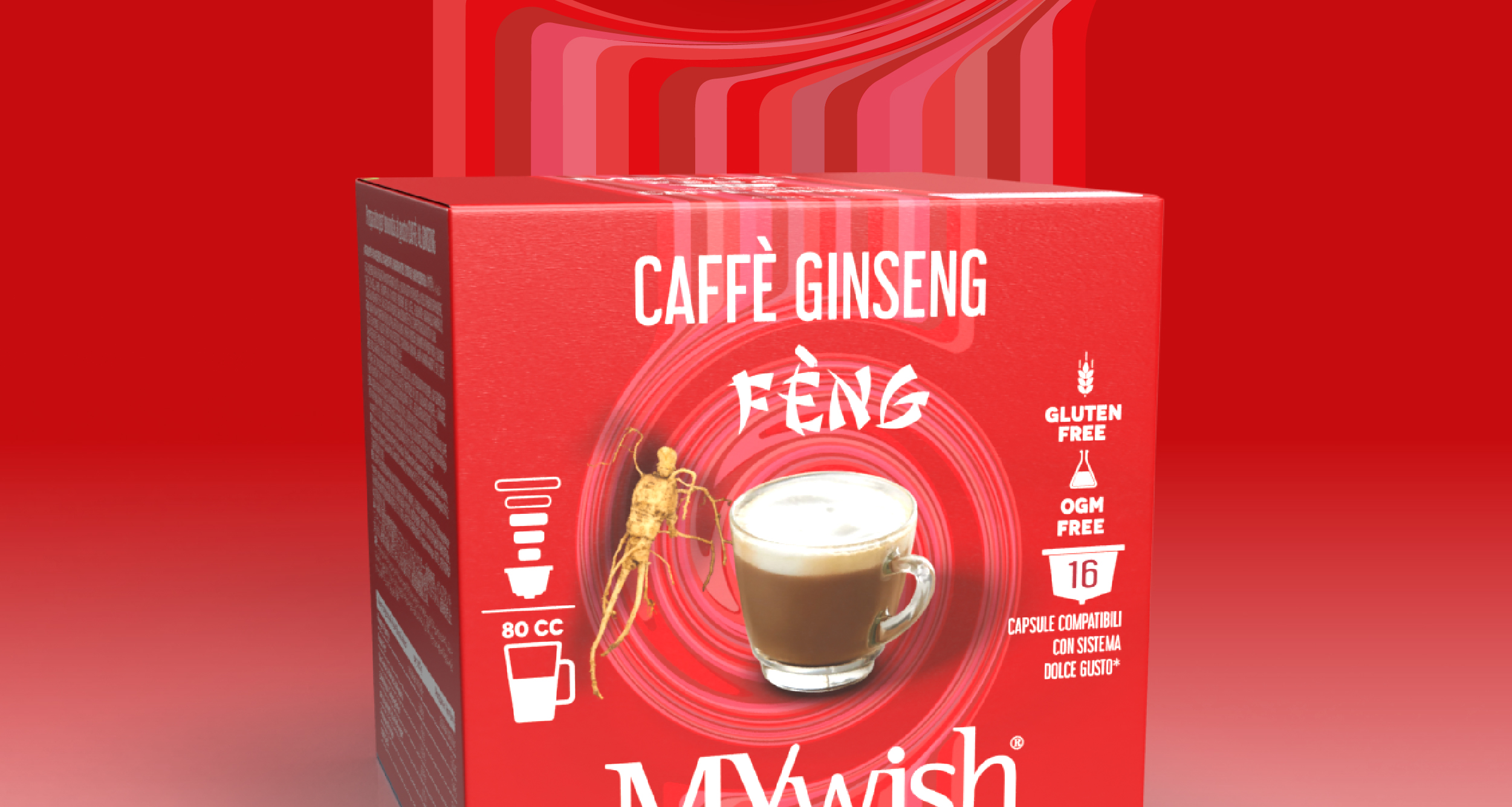
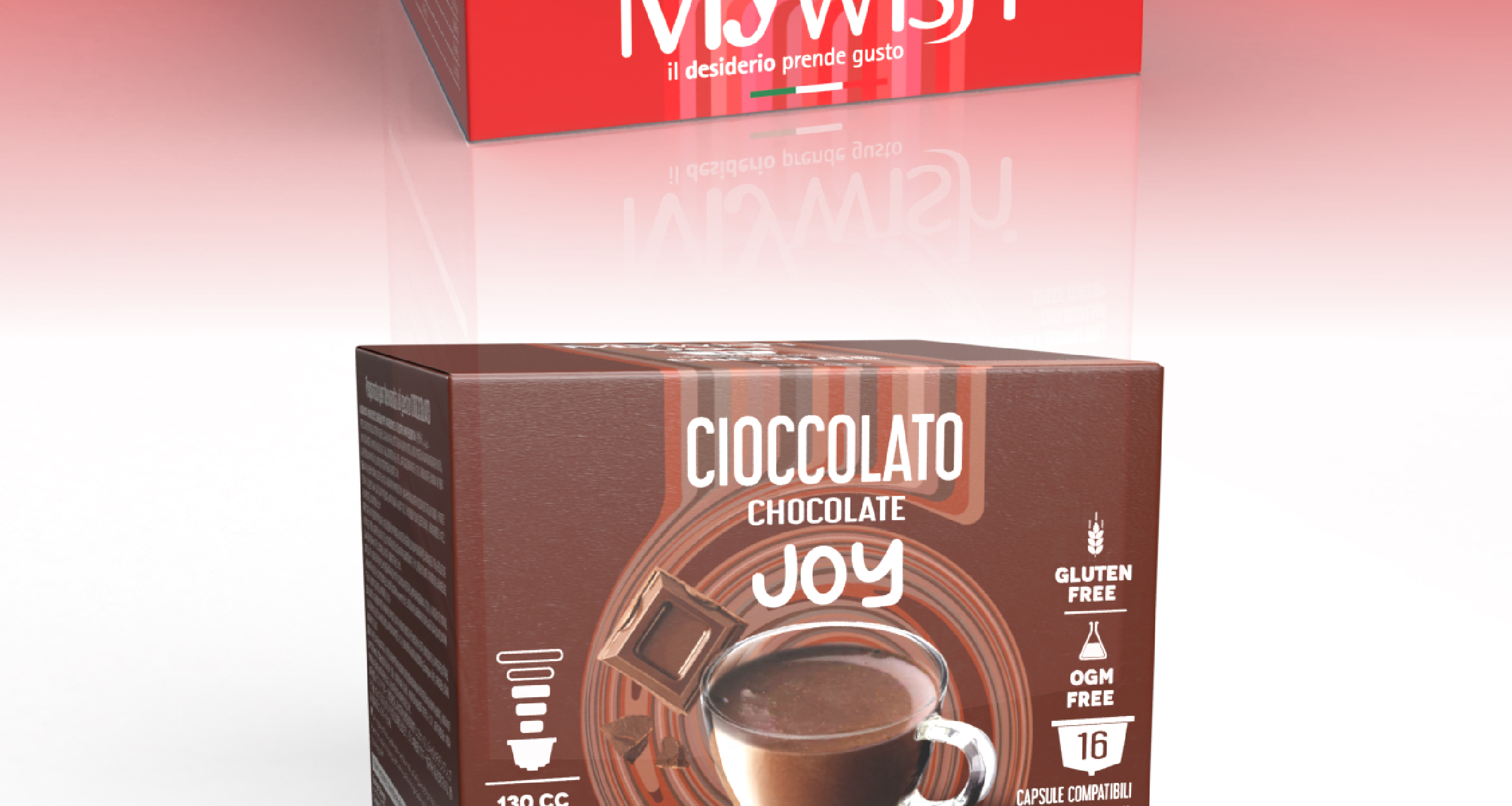
I designed a pencil case with a bold and recognizable look, working on a clean but striking composition. The swirl was integrated as a central element, building the visual identity of the line around it. The base colors were chosen to differentiate the various references, creating an immediate connection with the color of the drink inside, making it easier to identify the flavor and improving shelf readability.
Risult
A modern, dynamic, and highly recognizable packaging, able to stand out at the point of sale and strengthen the brand’s identity. The restyling has made the line more consistent, visually striking, and competitive within the target market.