
Antica Bottega Italia
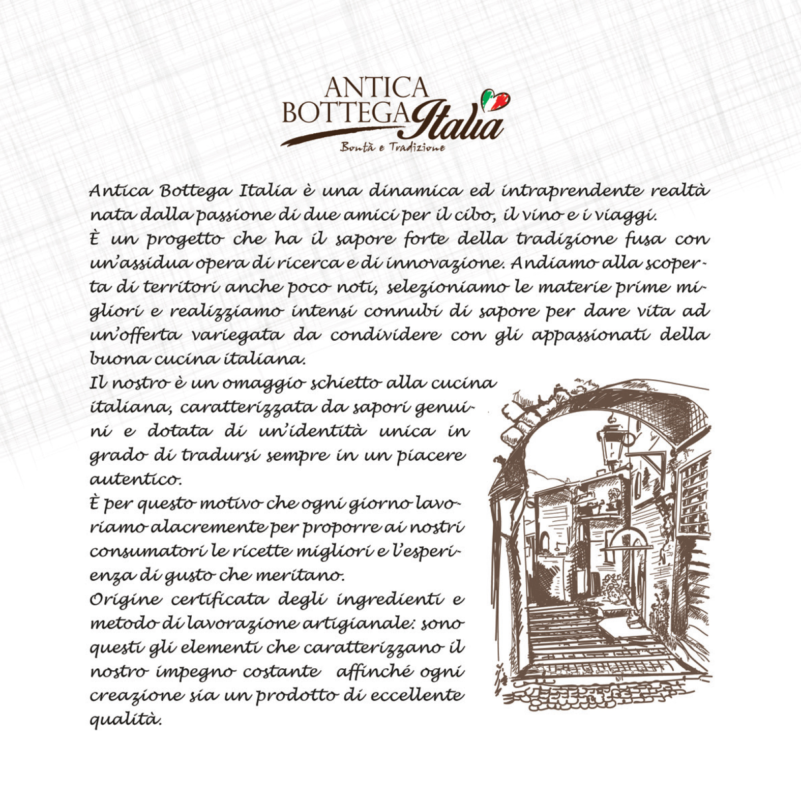
Antica Bottega Italia was born from the idea of two friends who decided to bring to the table innovative products that are easy to prepare and made with top-quality ingredients, to make the culinary experience a healthy and enjoyable moment.
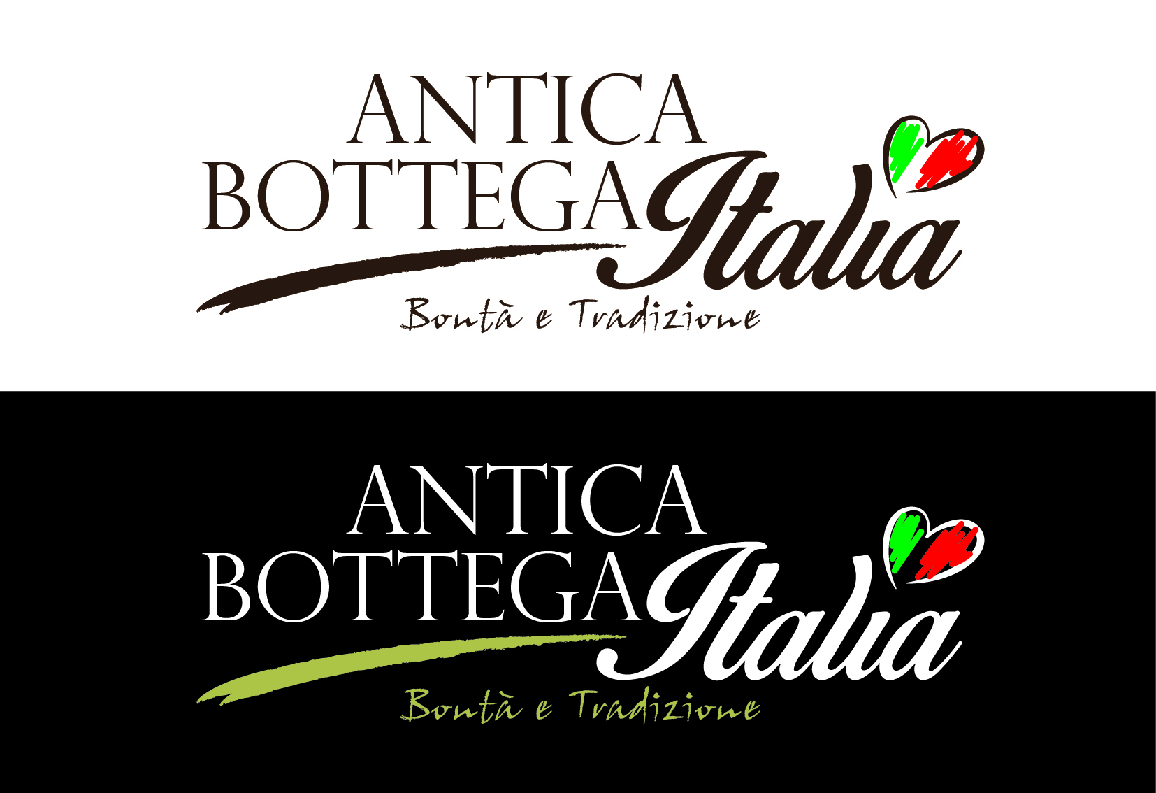
LOGO design Antica Bottega Italia
Goal
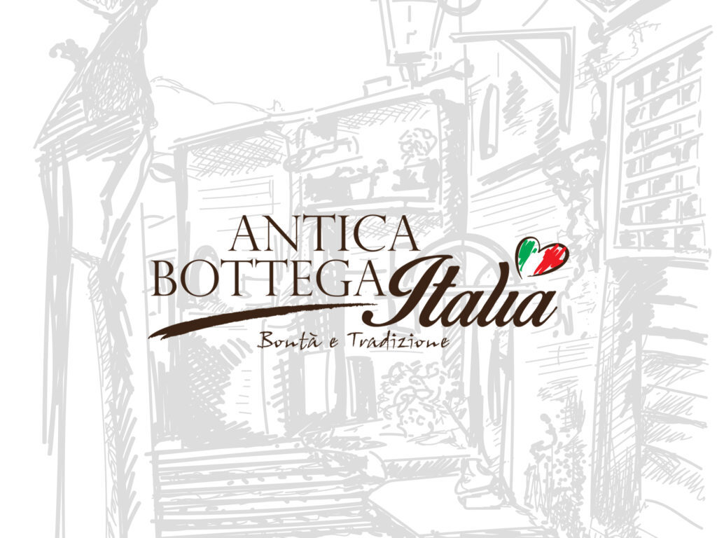
Create a simple, immediate, and visually striking logo that included the shape of a heart as the central element of its identity. The brand, initially called “CuorItalia,” needed to clearly communicate the Italian origin of the product and convey quality and craftsmanship.
Concept
The heart, a universal symbol of passion and authenticity, becomes the distinctive element of the graphic sign. The creative idea is based on the combination of two deliberately contrasting fonts, chosen to create a balance between elegance and personality. The word ‘Italy’ takes on more typographic weight, proudly highlighting its origin and the value of Made in Italy.
Development
The logo was created through the harmonious blending of the two typefaces, balancing thick and thin elements to achieve a strong and recognizable composition. The dot on the “i” was replaced with a hand-drawn tricolor heart, an element that highlights craftsmanship and attention to detail, while also visually reinforcing the connection to Italian identity.
Result
An essential but distinctive brand, able to convey passion, quality, and national pride. The logo combines simplicity and character, making it easy to remember and consistent with the brand’s values.
Packaging project
Obiettivo
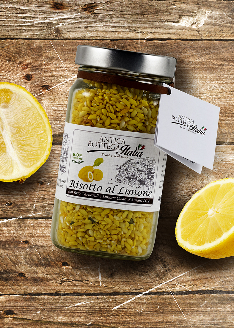
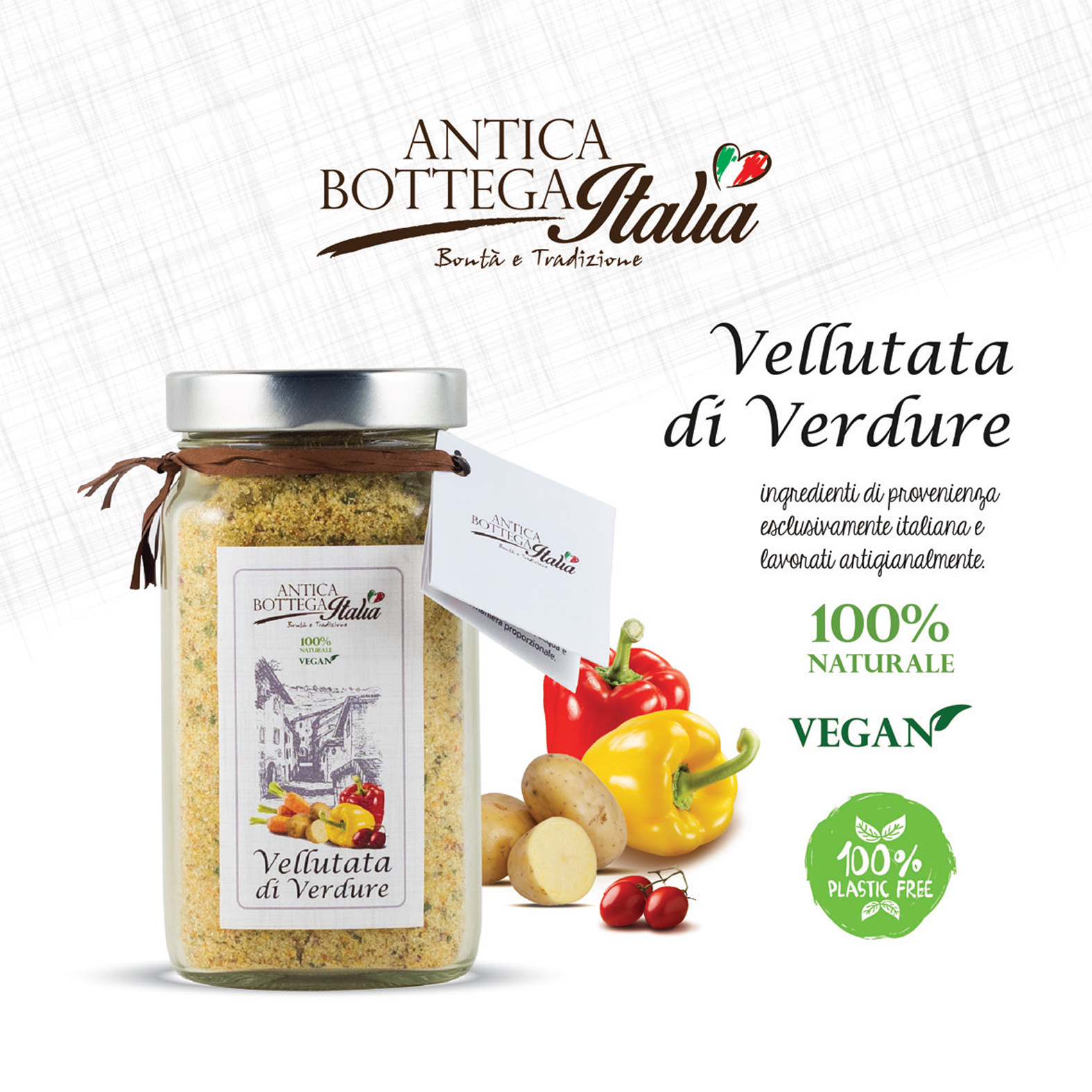
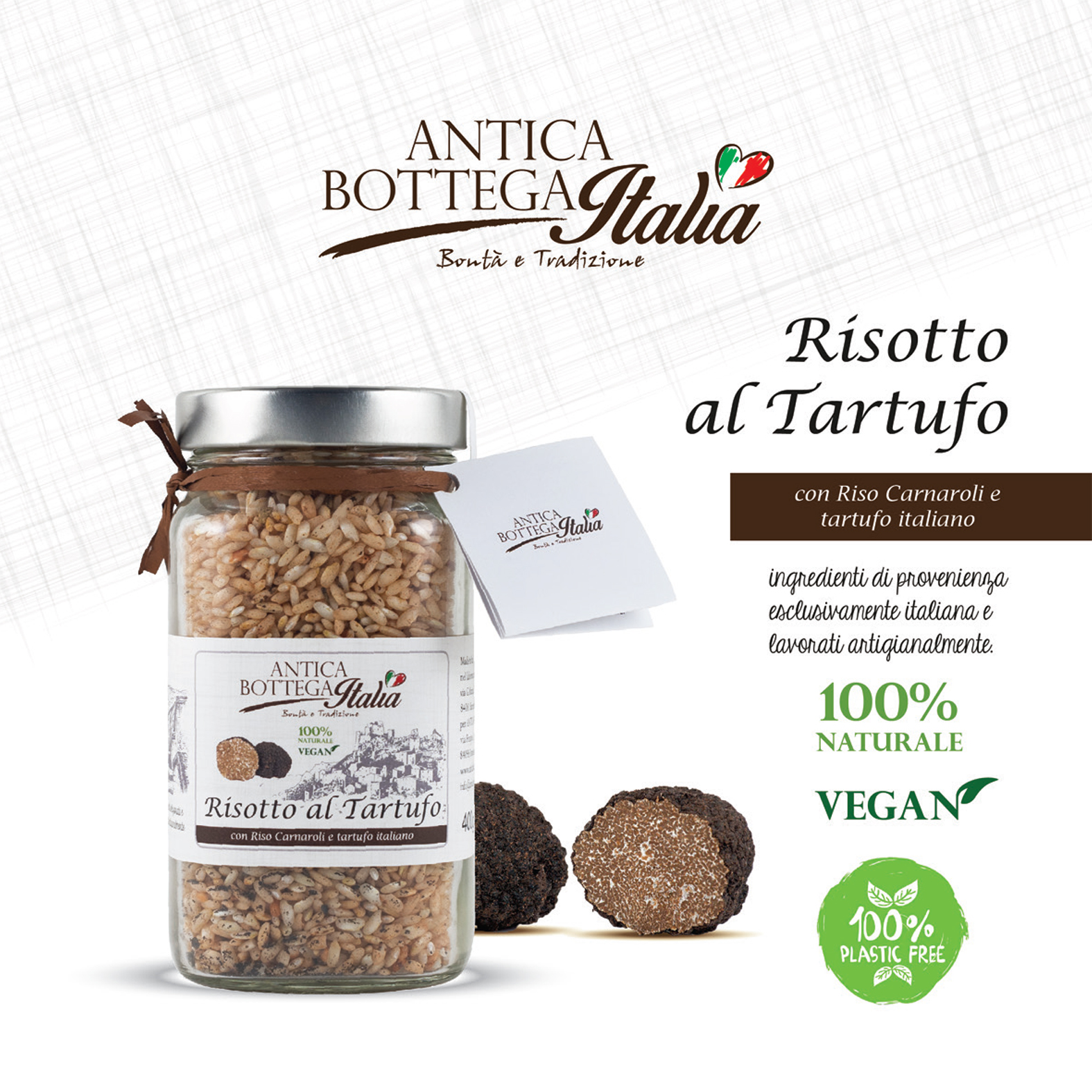
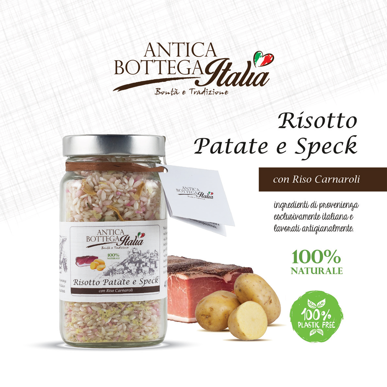
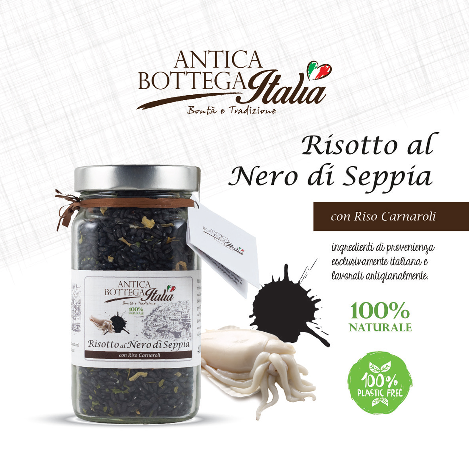
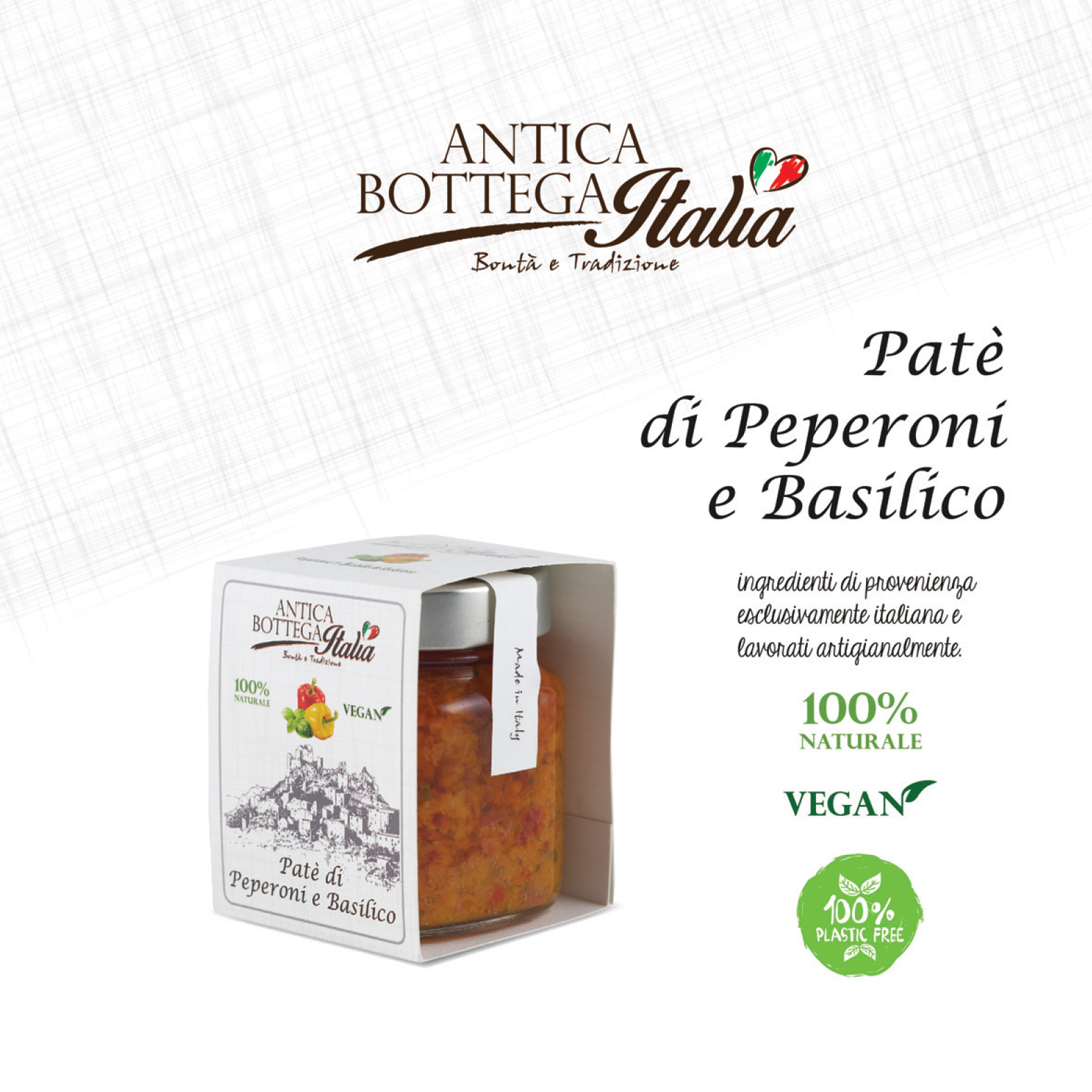
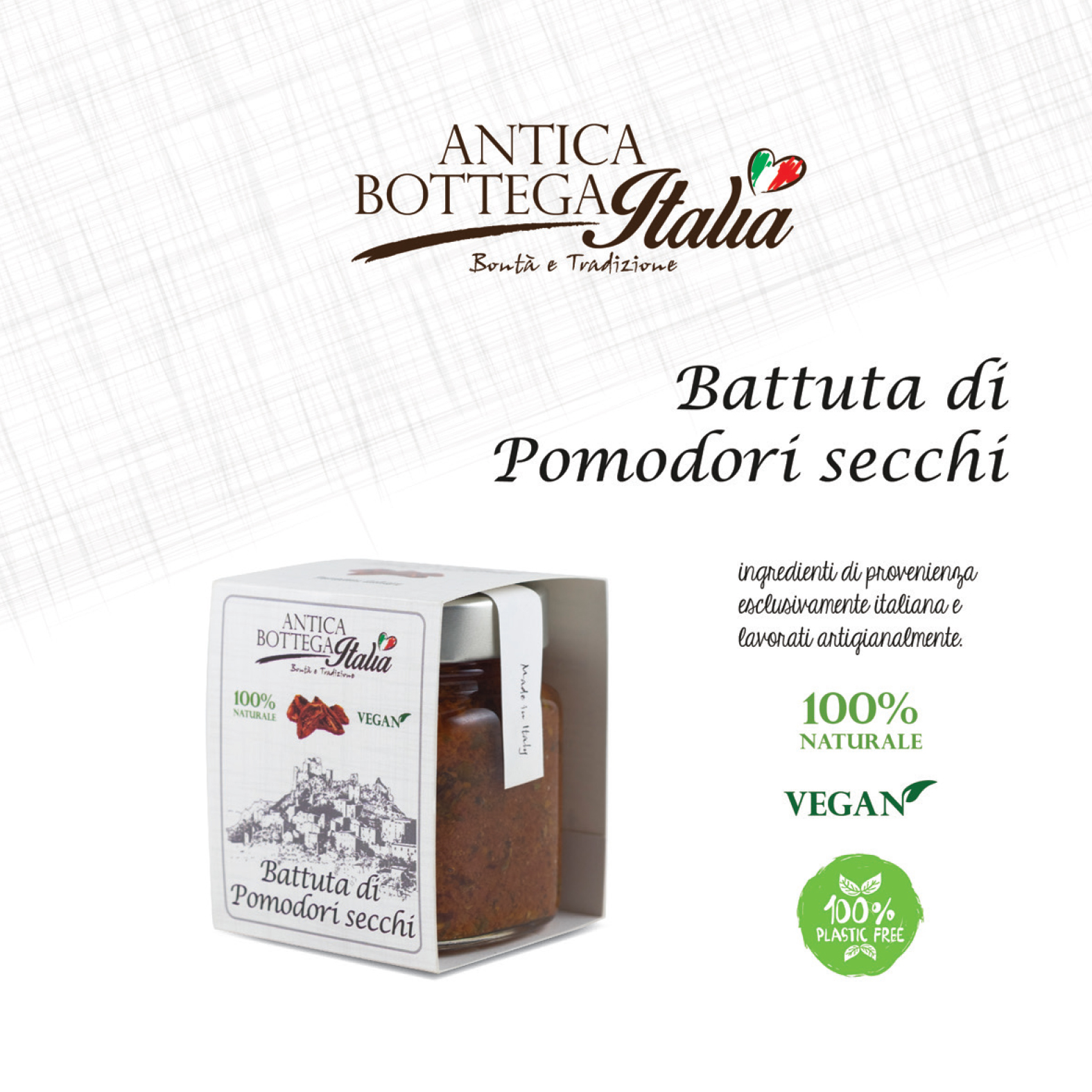
Develop an effective and sustainable packaging system that can highlight the quality of the product while keeping a careful balance between visual appeal and production costs. The project started as an experiment, aiming to find versatile and repeatable solutions.
Concept
The guiding idea was to combine simplicity and attention to detail, creating a coordinated image that is consistent but flexible. The variability of the references represented a design opportunity: differentiating the packaging while maintaining a recognizable and harmonious visual identity.
Development
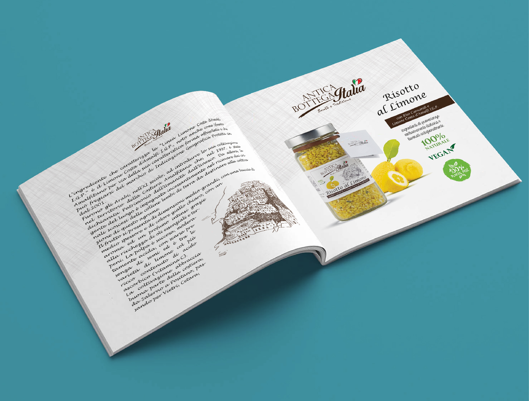
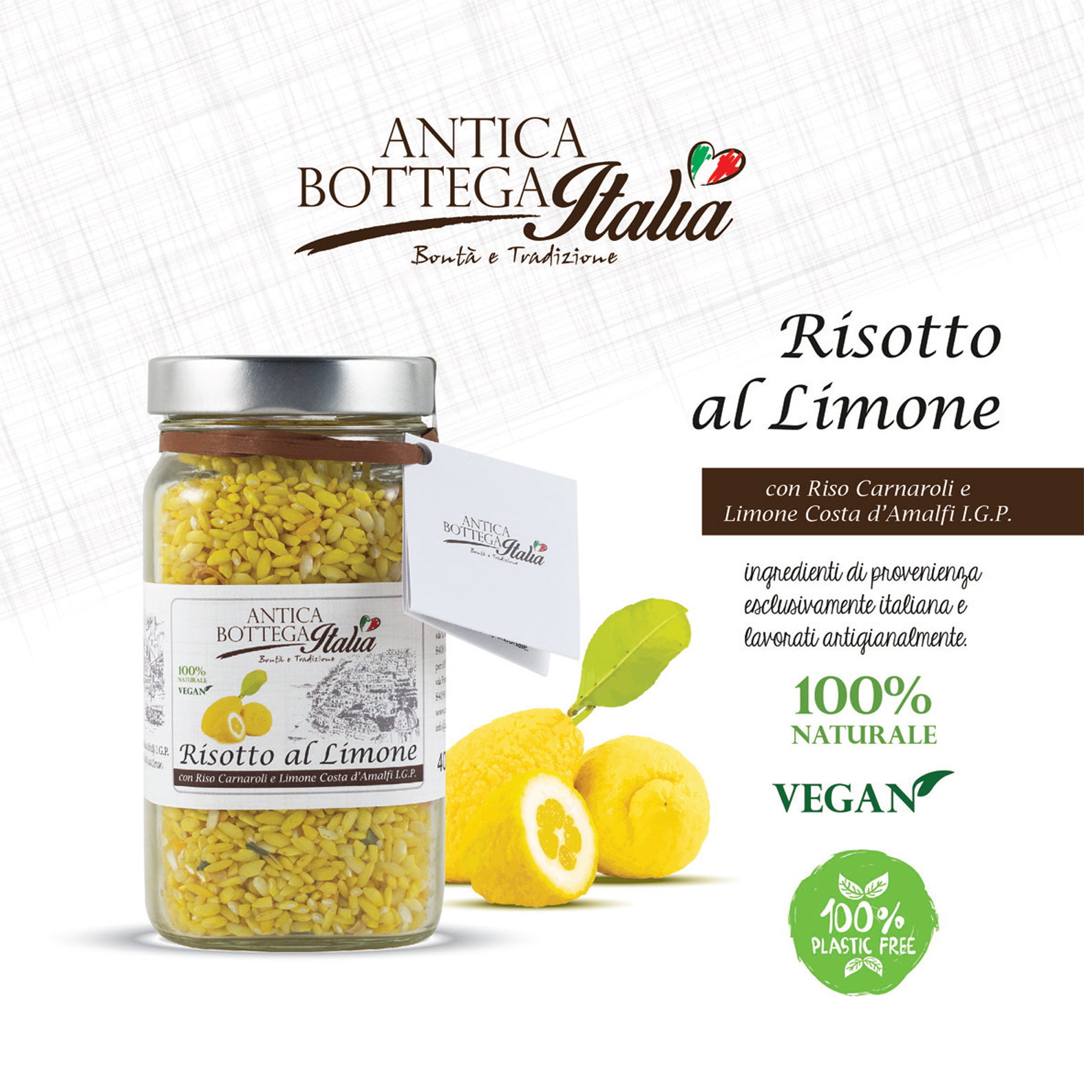
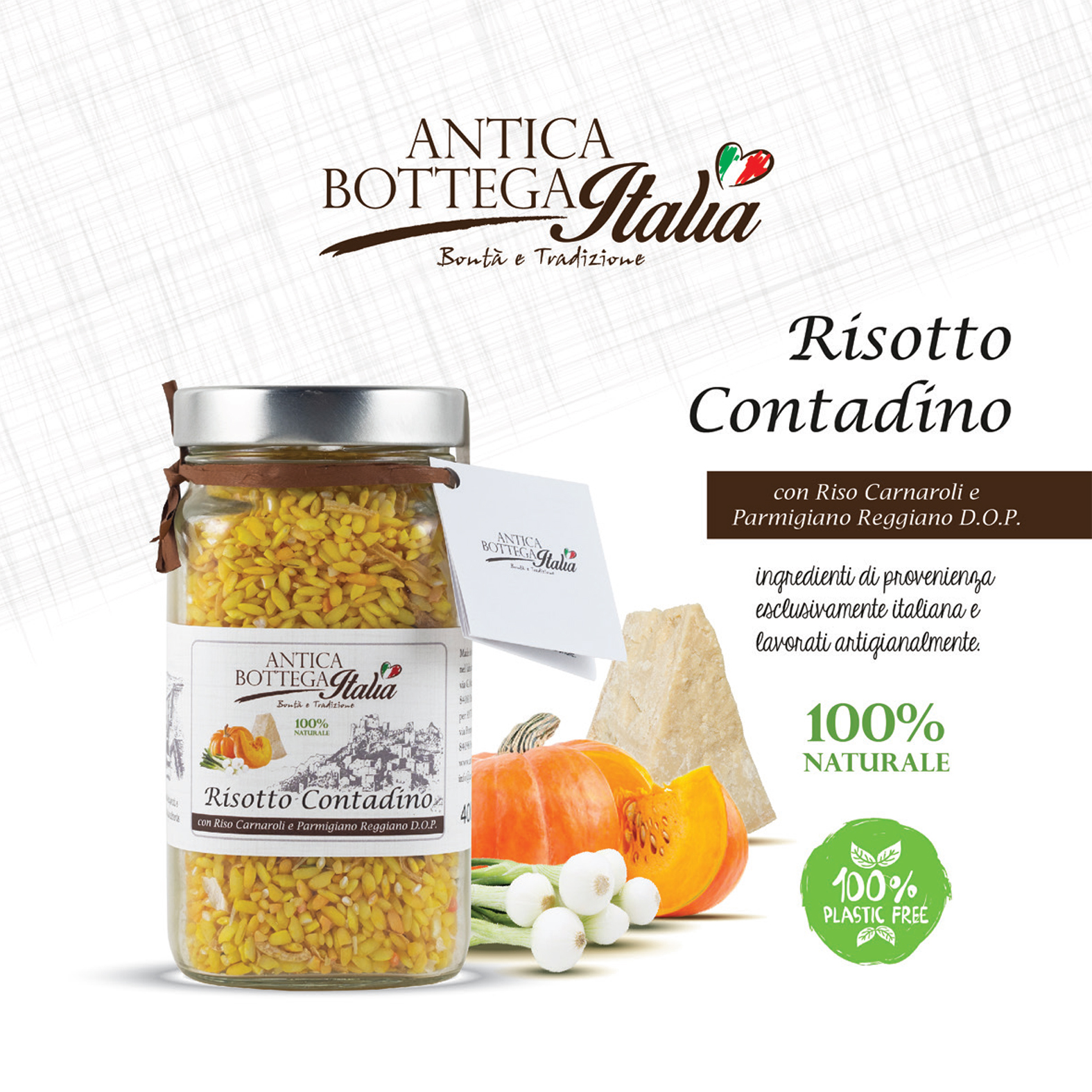
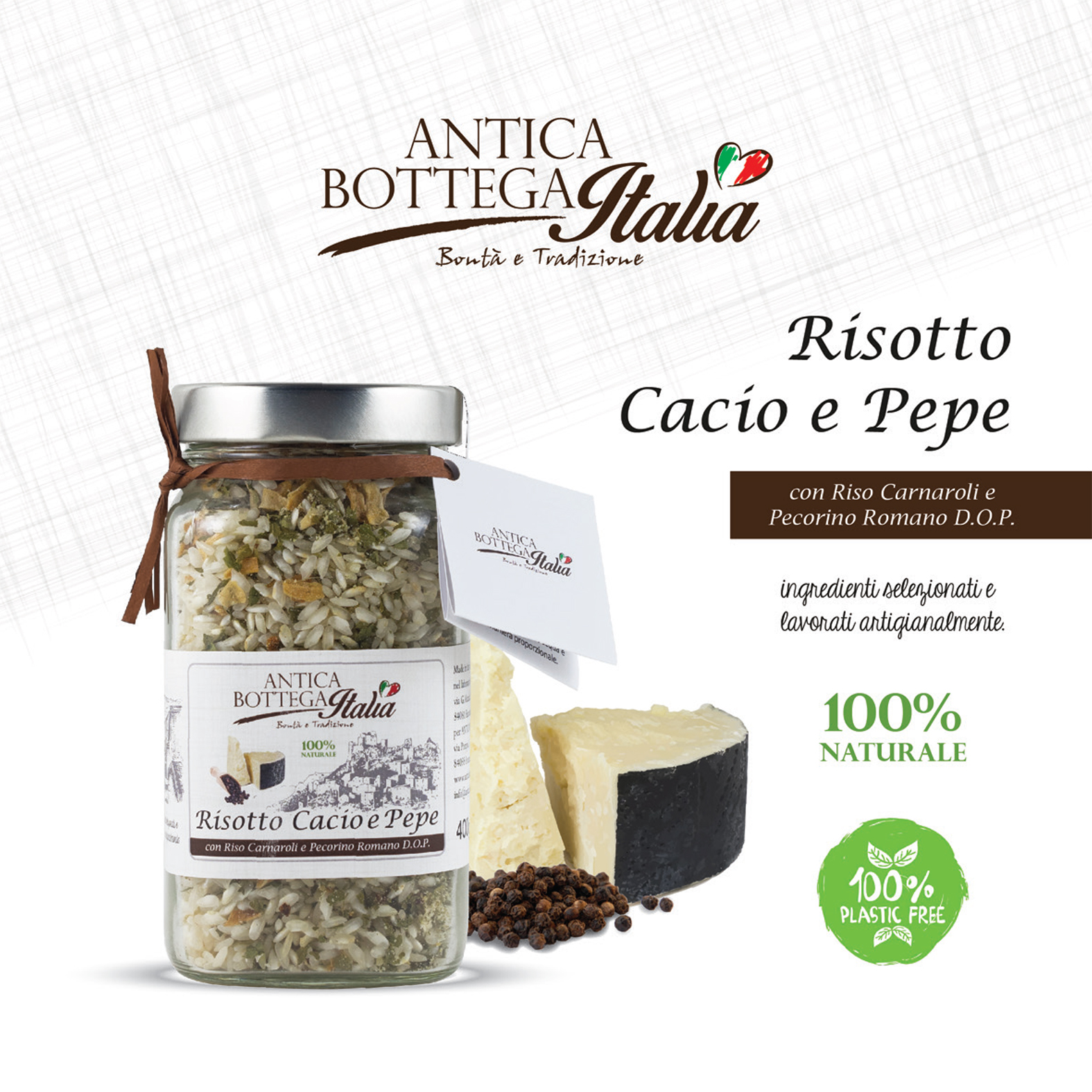
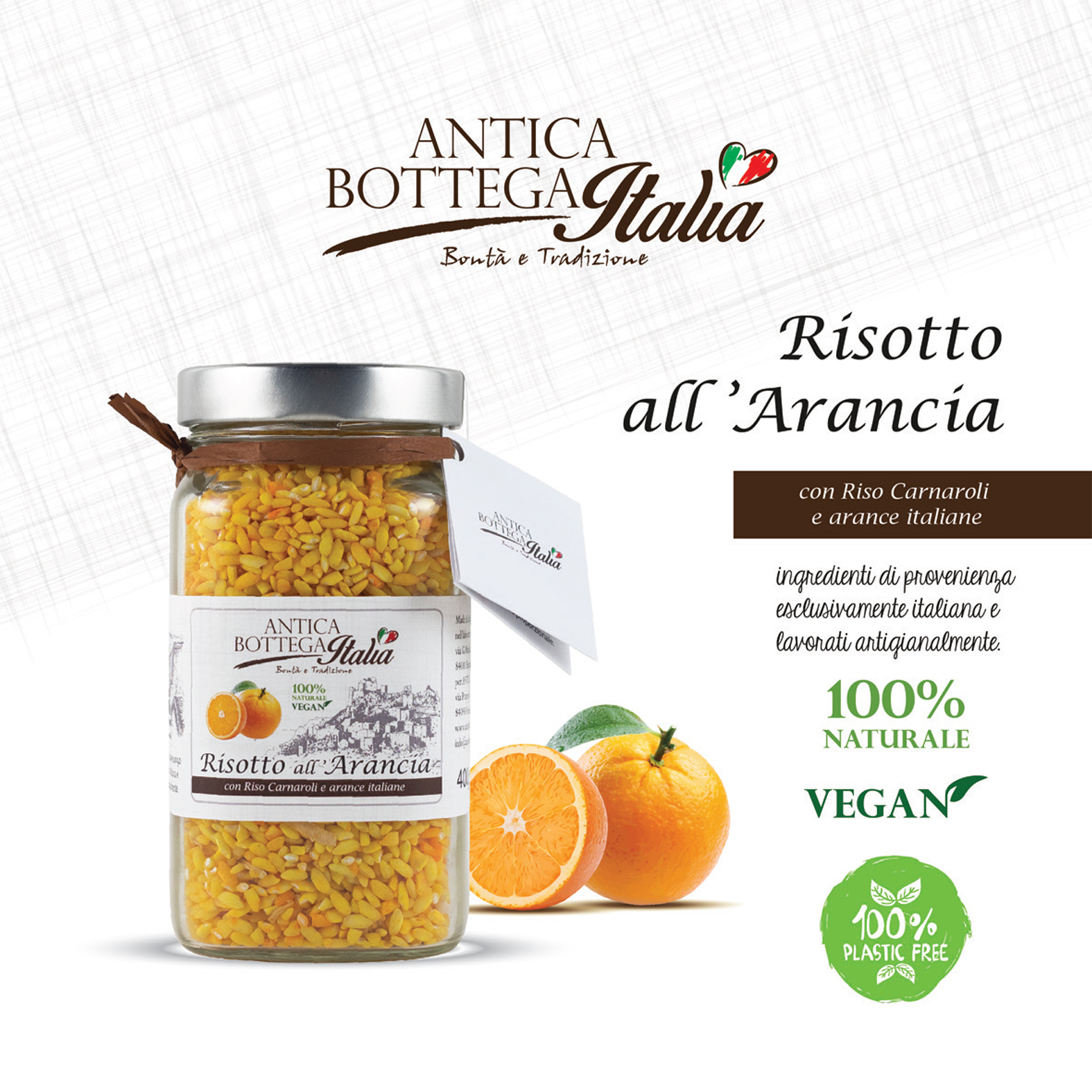
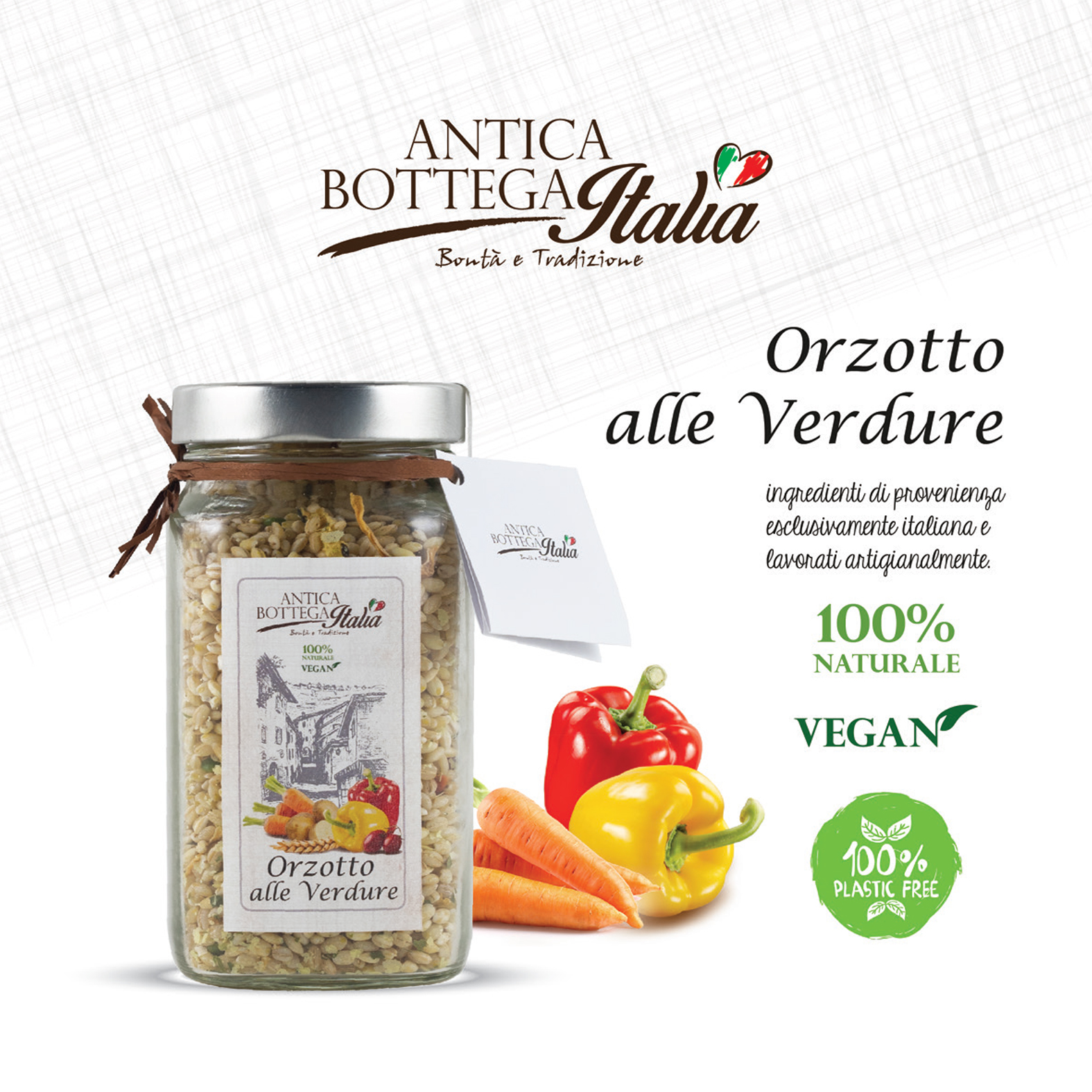
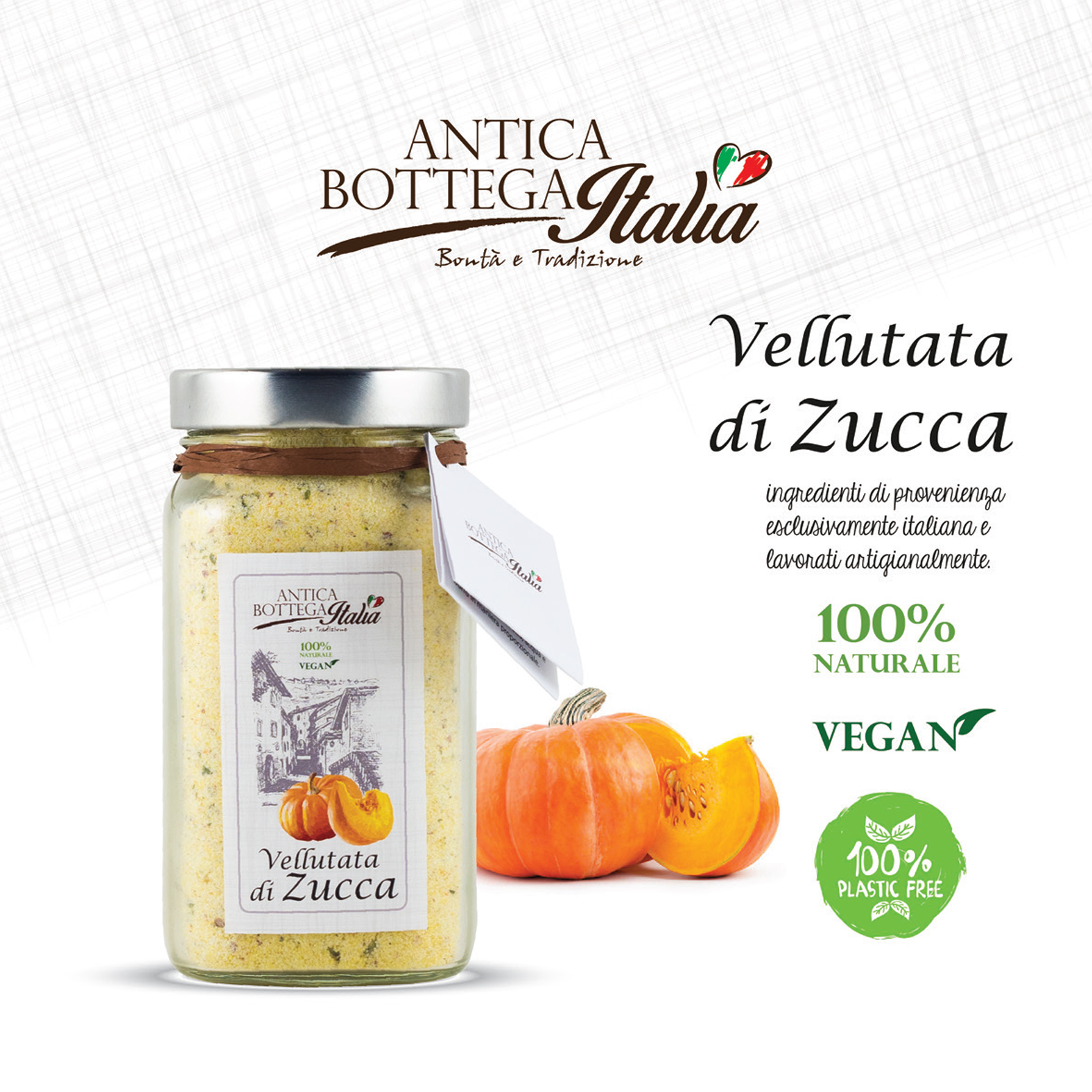
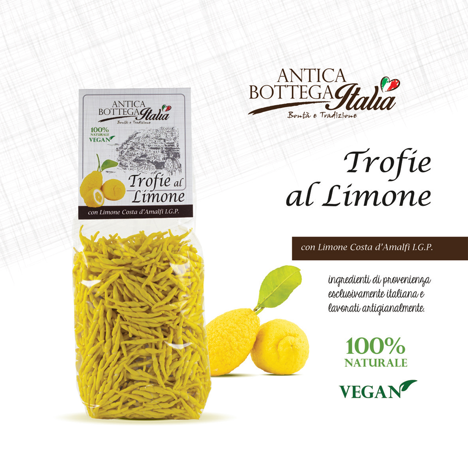
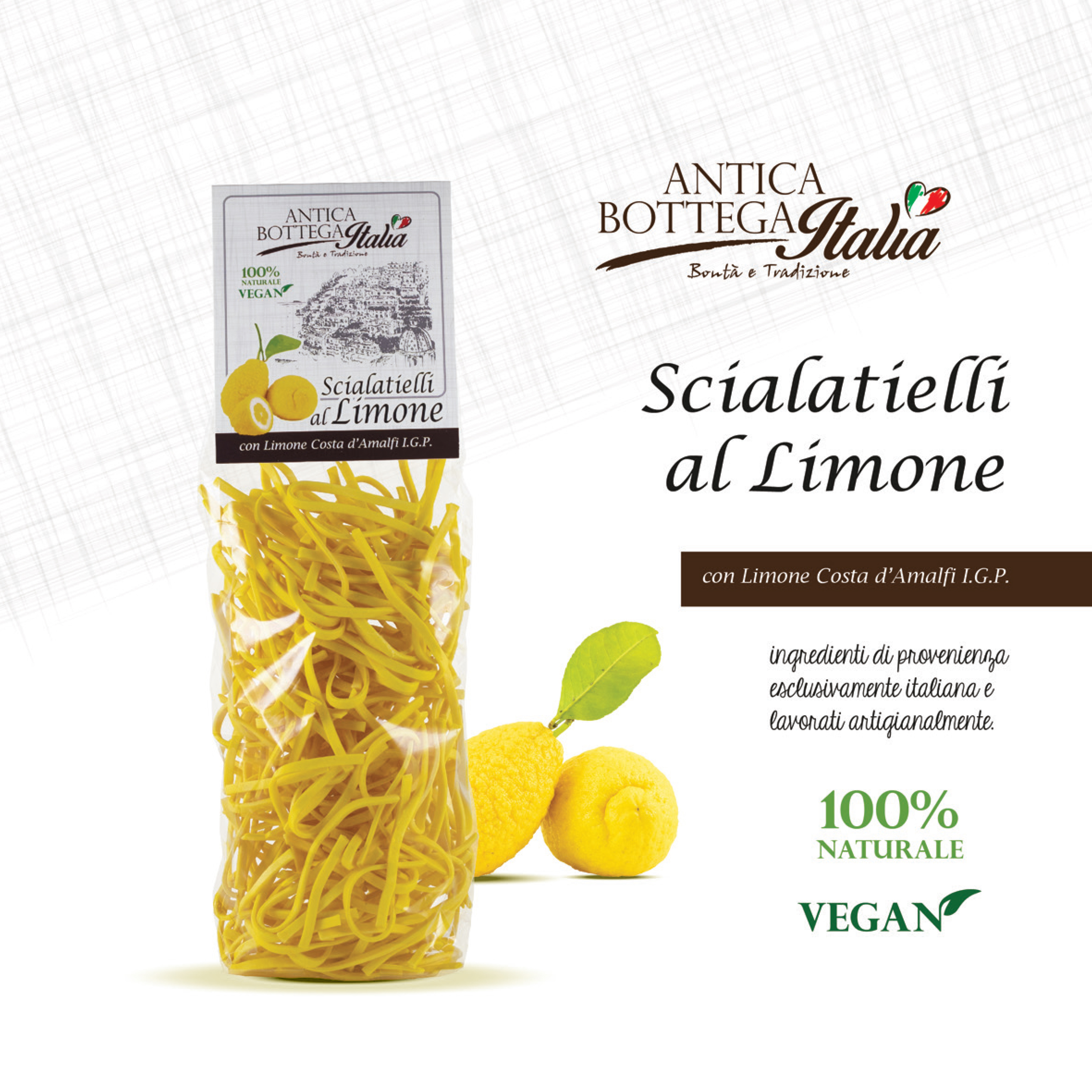
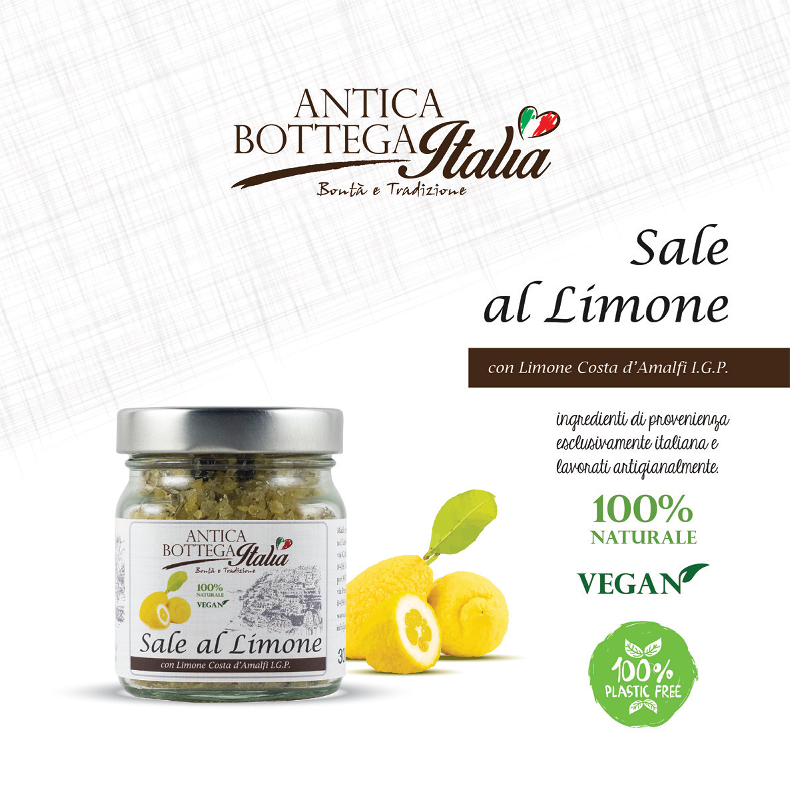
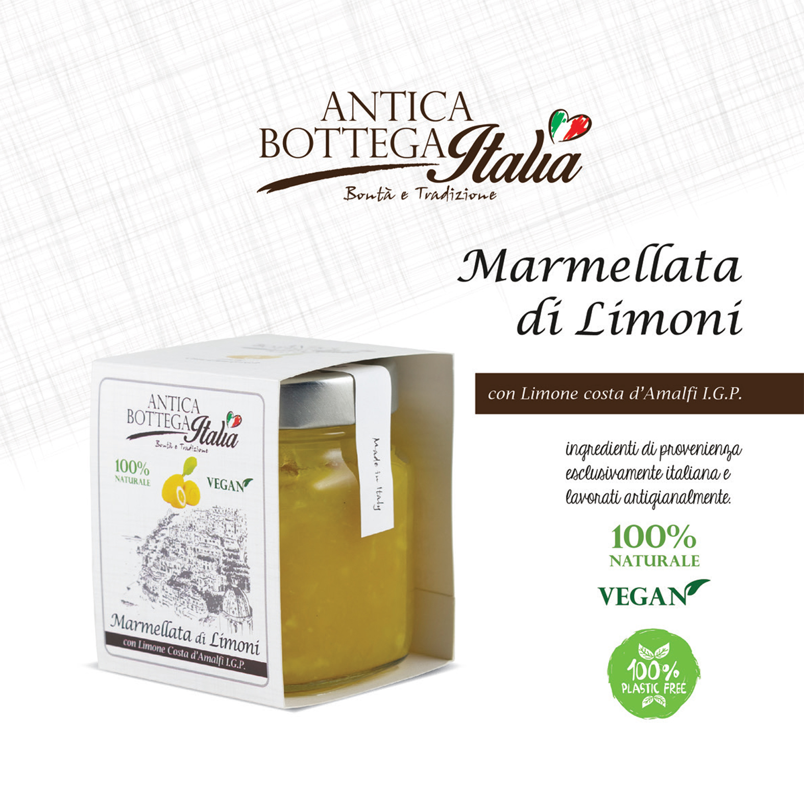
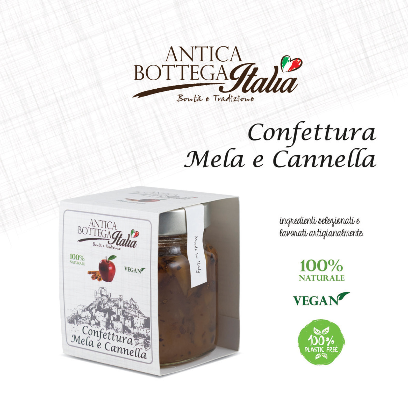
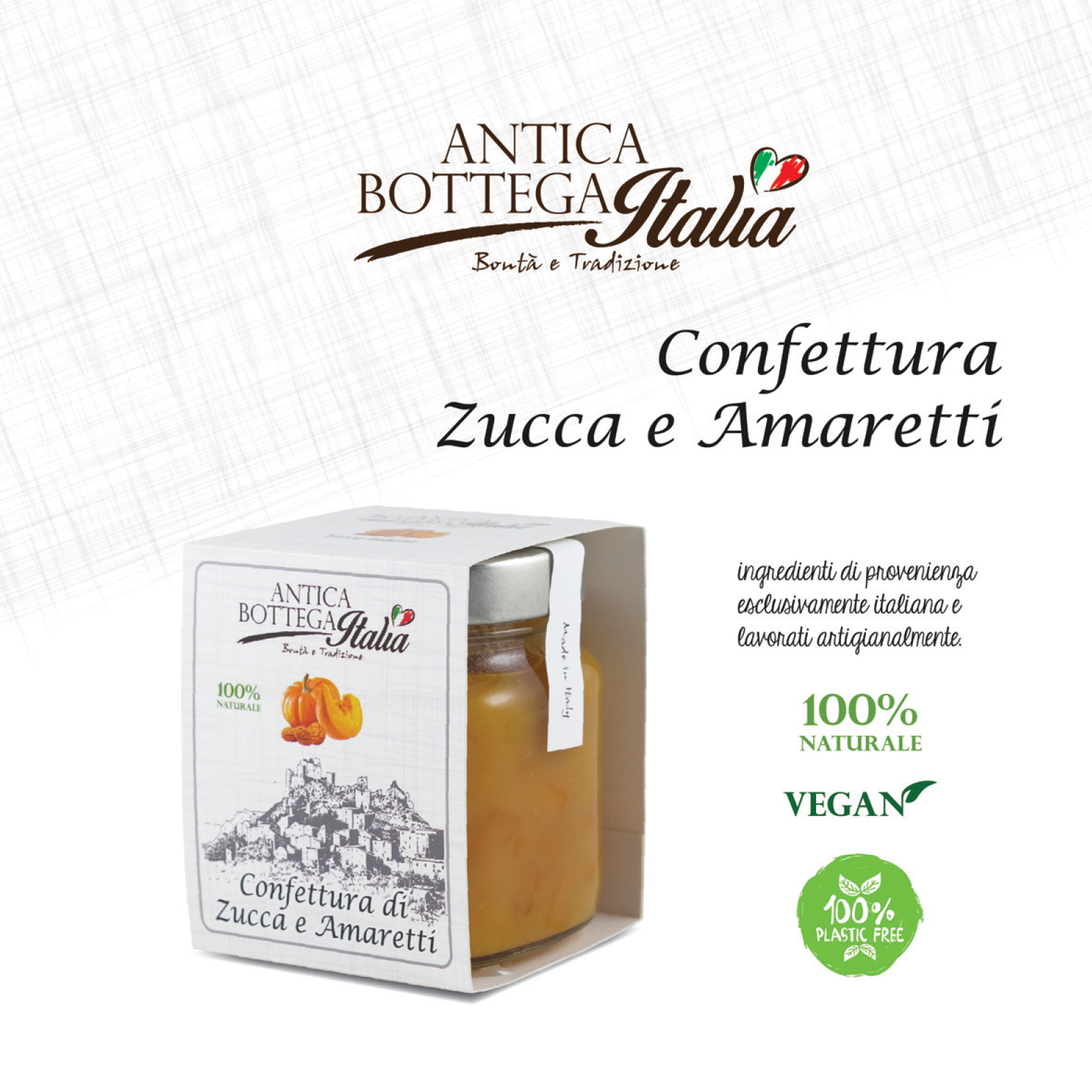
Different solutions were studied based on the product format, choosing personalized labels and cardboard bands applied to glass jars. To round out the visual and informational experience, I designed little hang tags with useful instructions and tips for preparing the dish, highlighting the product from a communication perspective as well.
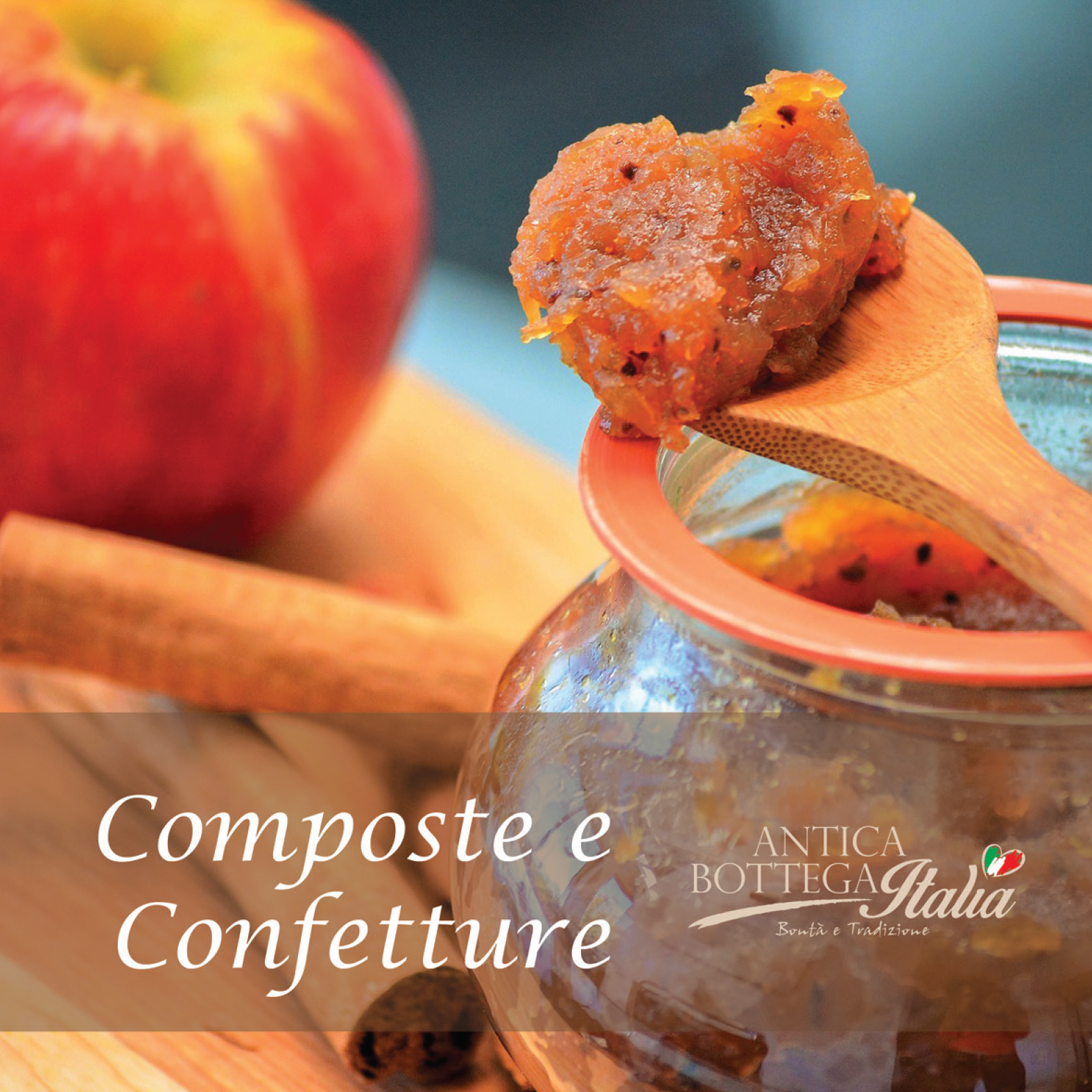
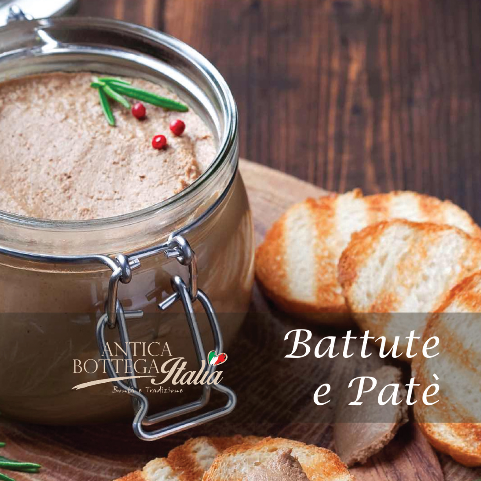
The project was wrapped up with a professional photo shoot aimed at showcasing the products and creating the catalog.
Result
A consistent, functional, and economically sustainable packaging system, capable of conveying quality and attention to detail. The integration of graphic design and photography has made it possible to create an effective coordinated image, ready for commercial and promotional communication.